Post by Jae Yoo on Mar 31, 2013 23:07:57 GMT -5
Hello Models!!!
This week, you need to submit a photo and relate it to any movies that you watch. Let's start the judging now
Bradley - What Just Happened

Jensen: GAH one of the rules was you needed to post an explanation!! lol But it's Easter Weekend and it's a busy time, so I'll let it slide, mostly because you are portraying the title itself. There's really no need for an explanation when it's the title, so I can forgive you for it. Just this once! lol This photo is really nice. I like it. And your expression is so spot on for the title. I'd grab this movie for sure just to see what just happened lmfao
Ayubot: PHOTOGRAPH ANALYSIS COMPLETE!
ANALYSIS:
FASHION CONTENT: 3
MODELLING CONTENT: 3
THEME CONNECTION: 5
EVALUATION: AYUBOT expected a more unorthodox photograph from the title "What Just Happened", perhaps something avant-garde and high fashion, but instead it is a let down. However, AYUBOT can definitely see the connection to the theme.
AREAS OF IMPROVEMENT:
Fashion content.
JY: I think you looked so clueless here which is perfect for the title of the movie that you chose. I love the sunglasses. Very cool. I think you're getting better from week to week. Great job
Sean: You've definitely matched your photo and your title well here. Like Ayubot, I would have liked more from it, but it's still good. You're portraying the emotion of befuddlement well. You're styled well-enough, but with the title of the movie you've chosen, there's not really a way to tie styling into the theme since this week, it's all about the expression with you... and you have that expression down.
Darren - X-Men
Jensen: That's what I love about this challenge, you can just choose your favourite photo and match it to any movie in the world!! I haven't heard of this movie yet but I'm an X-Men fan (movies) This is good although the batman cartoon drawing kind of throws me off, but i like how fierce you look in the face.
Ayubot: PHOTOGRAPH ANALYSIS COMPLETE!
ANALYSIS:
FASHION CONTENT: 4
MODELLING CONTENT: 3
THEME CONNECTION: 1
EVALUATION: AYUBOT deducts that this film: "X-Men: The Second Generation" has never been created. AYUBOT's database confirms that the photoshoot directions requested it to be any film ever made. This movie does not exist. Simply "X-Men" or "The Avengers would have done, as AYUBOT does not mind that it is an original character created by DARREN CRISS.
AREAS OF IMPROVEMENT:
The photoshoot directions were not followed.
AYUBOT requests that DARREN CRISS extend his neck. In this photograph, DARREN CRISS has no neck and several neck rolls.
JY: Darren I always love your photo. I think you nailed it from week to week. Unfortunately this week isn't one of them. I think it was too photoshopped and I don't like the way you chin down your head and hide your neck from us. At least, your theme connection is strong.
Sean: If I remember correctly, this comes directly from an episode of Glee. The fact that you named a movie that "hasn't been made, yet" doesn't bother me cause you made it a sequel to an already existing movie. I think the part about the shot needing to be from an actual movie was in there to make sure someone didn't make up a completely new title just to match a photo they like. In any event, the tie-in to a superhero movie is obvious here. I'm just not fond of the actual execution of it. I would have liked the photo to be a bit larger cause it's a little difficult to see you. I would like to have seen better angles from you cause your neck is looking a bit awkward here. Also, this is a nice shot for a comic book, but I'm not sure it's really the best shot to be using in a modeling competition. This week, you have the theme down really well, but we just needed to see more from you on a modeling standpoint.
Dave - The Mexican

Jensen: You made the right choice. I love this photo. There's so much emotion from both of you and the connection is great. I love the colouring and the styling. There is so much wonderful emotion coming from both of you. Also, I'm not sure if I've said this before, but I love a photo that tells a story. So I'm glad you went there with your description. Because there's a definite story here.
Ayubot: PHOTOGRAPH ANALYSIS COMPLETE!
ANALYSIS:
FASHION CONTENT: 2
MODELLING CONTENT: 3
THEME CONNECTION: 5
EVALUATION: AYUBOT sees the connection between the promotional picture and the picture DAVE ANNABLE submitted. However, most of DAVE ANNABLE's fashion is covered by the other model in this photograph. AYUBOT is not able to detect a majority of the fashion. Especially the shoes.
AREAS OF IMPROVEMENT:
Modelling content - Positioning to allow AYUBOT to see fashion.
JY: Wow.. This is great... This photo totally remind me of 'The Mexican' poster. I love the story, the theme connection is strong. I agree with Ayubot though. You can work more on the angle so we can see the fashion better. Overall nice job
Sean: Thanks for explaining the plot in your description because I've personally not seen the movie. Since you've described it, I can definitely see the connection to the theme in your photo. Neither one of you is really outshining the other in this photo and I would have liked for you to be the sole focus, but having equal focus isn't a bad thing, either. I love the way you're styled here and think the choice of location (particularly on a stairwell) is an interesting choice. I like the way you two are complimenting one another without being dressed identically.
Garrett - Sunset Boulevard

Jensen: *stands and applauds* First of all, Bravo on going back in time and choosing a classic. Mad props to a young guy that knows his Hollywood classics. I want to cry right now lol While the lighting would normally be irritating, it works so well for your movie choice. I love that you showed a comparison photo. It wasn't necessary but it helps sell your point. The phone, the typewriter, the cigarette and old fashioned ash tray. This is your most artistic shot to date and I really love this. *wipes tears away*
Ayubot: PHOTOGRAPH ANALYSIS COMPLETE!
ANALYSIS:
FASHION CONTENT: 2
MODELLING CONTENT: 2
THEME CONNECTION: 5
EVALUATION: AYUBOT definitely sees the theme connection to SUNSET BOULEVARD and the film noir genre. AYUBOT also sees the different elements listed but GARRETT HEDLUND, including old Hollywood, the photo example and mystery and fear. However, because of the lighting in this picture, AYUBOT finds it difficult to distinguish the fashion in this photograph, as well as the modelling.
AREAS OF IMPROVEMENT:
Lighting so AYUBOT can see fashion.
JY: Garrett... I'm so proud of you. Another good photo from you. I love the theme connection. The concept is great. I love the setting and the props so much. Be careful with the lighting. I think it would be better if you change this one to the black and white to inject the classic mood more. Overall, great job
Sean: Like Dave, I appreciate you taking the time to describe the plot of your film and how it applies to your shot this round since I have not seen the film you are referencing here. It definitely helps me see the connection between you and your film this round. The lighting is making it a bit hard for me to distinguish some of the details in this shot. I understand that the lighting is purposeful and necessary to create the proper mood, but it's making the expression on your face look a bit odd to me. Perhaps if I could have seen you better, I might like it more. Still, you have strong theme connection, I like the artistic value of the shot, and the modeling is fine enough.
Godfrey - Magic Mike
Jensen: I'm a bit disappointed unfortunately. You're three hours past the extended deadline, since you were online before Jae granted Dave's deadline request but nothing else, I'm going to assume you didn't ask for one. Then this, I dont' get it. You look rich and handsome, but I don't get male stripper from it. As stupid as the movie was, the dancing and stripping was good lol So I would have liked to have seen something connecting there. Otherwise, this, i'm left just wondering what it has to do with male strippers. I like your pose and your expression.
Ayubot: PHOTOGRAPH ANALYSIS COMPLETE!
ANALYSIS:
FASHION CONTENT: 5
MODELLING CONTENT: 5
THEME CONNECTION: 0
EVALUATION: AYUBOT is pleased to see fashion and modelling in this photograph. But AYUBOT does not see "Magic Mike" in this photograph, or a stripper, or a gigolo. AYUBOT sees a film that is more fashion-based like "THE DEVIL WEARS PRADA", "ZOOLANDER" or "CONFESSIONS OF A SHOPAHOLIC"
AREAS OF IMPROVEMENT:
Theme connection.
Also, AYUBOT notes that GODFREY GAO was tardy. Please ask for an extension if you need one.
JY: This is a good and very strong photo but the theme connection? I don't really get that. I love this photo alone. The fashion is strong. You looked like a good model but I'm worried for you because the connection with the theme is so poor.
Sean: I was hoping your description would help me get to the Magic Mike part of this photo cause the shot itself wasn't getting me there. Unfortunately, the description didn't really help me get there, either. It's a shame cause this is a nice, solid photo, but on a week where you pretty much get to choose your theme, word choice is so very important. This would have been a good photo for so many other things, but as a Magic Mike photo, this just isn't strong enough for me. I understand that real life came in the way for you this round and real life definitely takes precedence. We just have to judge based on what we see here, though.
Heechul - The Hangovers

Jensen: What surprises me most is that you didn't use that photo Ayumi loved lmfao I thought for sure once you saw the theme you'd find a way to use it knowing how much everyone liked it. What I like here is you kept the synopsis the same despite changing all the characters. At first I dind't like it but then I saw that the rest was the same so I was ok. You do look a bit hungover, holding your head like that. I'm not liking the lighting affect but only around your head. It does make for a dizzying affect which works for The Hangover, but I'm not loving it. Other than that, you have done really well this round. I'm glad to finally see some modeling from you.
Ayubot: PHOTOGRAPH ANALYSIS COMPLETE!
ANALYSIS:
FASHION CONTENT: 5
MODELLING CONTENT: 3
THEME CONNECTION: 5
EVALUATION: WHO IS THIS? AYUBOT loves the fashion content in this photograph, and wonders why HEECHUL KIM has not brought this to the table before? AYUBOT sees a blur of "THE HANGOVER" in this photograph. AYUBOT is very pleased.
AREAS OF IMPROVEMENT:
Modelling Content could be stronger.
JY: Wow... I love this photo so much!!! Heechul, last week I was so impressed with you but this week is much better. The connection is great and the fashion is very strong. This is a model. Love this. You're getting better and better. Keep it up.
Sean: There are very few occasions where I'd say that blurring effect is appropriate, but this is one of those times. You've met the vibe of your movie well with this photo and you look good while doing it. That pose is definitely appropriate and I like the way you're styled, too. You look like you've just gotten back from a wild night out on the town. Great work Heechul.
Josh H - Into The Wild

Jensen: Gosh, you look.......................like....................a.......................MAN!!!!! This is your best manly shot to date!!! You don't look like a little child anymore. I really like this photo and your connection with the movie. The setting is perfect for sure. You look rugged. You picked a good movie and photo.
Ayubot: PHOTOGRAPH ANALYSIS COMPLETE!
ANALYSIS:
FASHION CONTENT: 2
MODELLING CONTENT: 2
THEME CONNECTION: 4
EVALUATION: AYUBOT is unsure about this photograph. Although AYUBOT enjoys the fact that JOSH HUTCHERSON looks more mature, AYUBOT feels fashion content and modelling content are lacking in this photograph. JOSH HUTCHERSON is missing an arm, and the fashion is very bland.
AREAS OF IMPROVEMENT:
Keep your limbs mostly visible.
JY: I like this. I love the concept and the angle is decent. I think this photo is very straight forward so be careful with that. Don't ignore the fashion value 100% cause after all, this is still a modelling competition. But overall, I really like this side of you.
Sean: I'm definitely liking the older look of this photo. You've definitely had a problem with looking too young, but that's not a problem here. On a modeling level, this may not be the best, but it's still a solid shot. The pose makes sense for what you were going for in the shot and while I would have liked your clothes to be dirtier or torn since you're surviving in the wild, this can make sense as a shot of when you first went out into the wild; the beginning of your journey. The watermark in the shot doesn't bother me, either. It blends in with the photo well enough that it's not distracting at all.
Liam - The Chronicles of Narnia: The Lion, The Witch, and The Wardrobe

Jensen: Another picture comparison YAY. I have not seen this movie so I'm very thankful for your description. Your photo is amazing. The lion is so majestic looking. I like the setting. I think you've done beautifully. Your chest is also majestic lol Nice job!
Ayubot: PHOTOGRAPH ANALYSIS COMPLETE!
ANALYSIS:
FASHION CONTENT: 3
MODELLING CONTENT: 4
THEME CONNECTION: 5
EVALUATION: At first AYUBOT thought "THE LION KING" when she first saw the photo, but now AYUBOT sees the screenshot from "THE LION, THE WITCH, AND THE WARDROBE" and AYUBOT can see the connection very well. AYUBOT does like the pose, and the fact that she can see all LIAM HEMSWORTH's limbs, but finds the fashion boring.
AREAS OF IMPROVEMENT:
More fashion appeal.
JY: Great job again, Liam. Wow... Just wow... I think the concept is great and you nailed the theme connection. Great job. You're the one to beat. Be careful, boys!!!
Sean: I was able to tell what your movie was without even having to read about it. You definitely have the theme aspect nailed. I love the way you're styled here cause you're dressed perfectly for the locale. The pose is strong and it pairs nicely with the stance of the lion. Great work, Liam.
Stephen - Robin Hood

Jensen: Another picture comparison, love it!!! Nothing against those who didn't do it though lol I like this. You look so buff and intense. You're much better looking than Russell is as well lol I really like that you were finally able to incorporate your Robin Hood theme somewhere. Good job.
Ayubot: PHOTOGRAPH ANALYSIS COMPLETE!
ANALYSIS:
FASHION CONTENT: 0
MODELLING CONTENT: 3
THEME CONNECTION: 5
EVALUATION: AYUBOT's notes from AYUMI HAMASAKI indicate that STEPHEN AMELL used a photo in the almost exact pose last time, using the same weapon. AYUBOT cannot deny the theme connection is strong when compared to the movie poster, but it is repetitive.
AREAS OF IMPROVEMENT:
Keep the judges interested by not being repetitive.
JY: Good photo but I agree with Ayubot. This photo felt so repetitive. But the theme connection is strong and I think you will be fine this week.
Sean: It's great that you have an exact replica of the movie you went for this round. I'm a little disappointed to see another Green Arrow shot, especially since you just used one last round, but I can see why you did it. It was a great photo and matched the theme exactly. I do have to count off a little for repetition, but overall, this was good work.
This week, you need to submit a photo and relate it to any movies that you watch. Let's start the judging now
Bradley - What Just Happened
Jensen: GAH one of the rules was you needed to post an explanation!! lol But it's Easter Weekend and it's a busy time, so I'll let it slide, mostly because you are portraying the title itself. There's really no need for an explanation when it's the title, so I can forgive you for it. Just this once! lol This photo is really nice. I like it. And your expression is so spot on for the title. I'd grab this movie for sure just to see what just happened lmfao
Ayubot: PHOTOGRAPH ANALYSIS COMPLETE!
ANALYSIS:
FASHION CONTENT: 3
MODELLING CONTENT: 3
THEME CONNECTION: 5
EVALUATION: AYUBOT expected a more unorthodox photograph from the title "What Just Happened", perhaps something avant-garde and high fashion, but instead it is a let down. However, AYUBOT can definitely see the connection to the theme.
AREAS OF IMPROVEMENT:
Fashion content.
JY: I think you looked so clueless here which is perfect for the title of the movie that you chose. I love the sunglasses. Very cool. I think you're getting better from week to week. Great job
Sean: You've definitely matched your photo and your title well here. Like Ayubot, I would have liked more from it, but it's still good. You're portraying the emotion of befuddlement well. You're styled well-enough, but with the title of the movie you've chosen, there's not really a way to tie styling into the theme since this week, it's all about the expression with you... and you have that expression down.
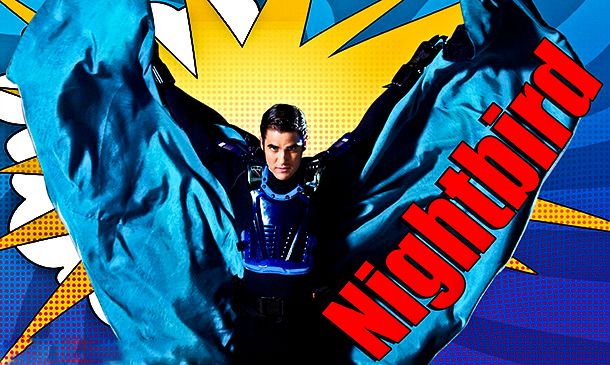
Darren - X-Men
Jensen: That's what I love about this challenge, you can just choose your favourite photo and match it to any movie in the world!! I haven't heard of this movie yet but I'm an X-Men fan (movies) This is good although the batman cartoon drawing kind of throws me off, but i like how fierce you look in the face.
Ayubot: PHOTOGRAPH ANALYSIS COMPLETE!
ANALYSIS:
FASHION CONTENT: 4
MODELLING CONTENT: 3
THEME CONNECTION: 1
EVALUATION: AYUBOT deducts that this film: "X-Men: The Second Generation" has never been created. AYUBOT's database confirms that the photoshoot directions requested it to be any film ever made. This movie does not exist. Simply "X-Men" or "The Avengers would have done, as AYUBOT does not mind that it is an original character created by DARREN CRISS.
AREAS OF IMPROVEMENT:
The photoshoot directions were not followed.
AYUBOT requests that DARREN CRISS extend his neck. In this photograph, DARREN CRISS has no neck and several neck rolls.
JY: Darren I always love your photo. I think you nailed it from week to week. Unfortunately this week isn't one of them. I think it was too photoshopped and I don't like the way you chin down your head and hide your neck from us. At least, your theme connection is strong.
Sean: If I remember correctly, this comes directly from an episode of Glee. The fact that you named a movie that "hasn't been made, yet" doesn't bother me cause you made it a sequel to an already existing movie. I think the part about the shot needing to be from an actual movie was in there to make sure someone didn't make up a completely new title just to match a photo they like. In any event, the tie-in to a superhero movie is obvious here. I'm just not fond of the actual execution of it. I would have liked the photo to be a bit larger cause it's a little difficult to see you. I would like to have seen better angles from you cause your neck is looking a bit awkward here. Also, this is a nice shot for a comic book, but I'm not sure it's really the best shot to be using in a modeling competition. This week, you have the theme down really well, but we just needed to see more from you on a modeling standpoint.
Dave - The Mexican
Jensen: You made the right choice. I love this photo. There's so much emotion from both of you and the connection is great. I love the colouring and the styling. There is so much wonderful emotion coming from both of you. Also, I'm not sure if I've said this before, but I love a photo that tells a story. So I'm glad you went there with your description. Because there's a definite story here.
Ayubot: PHOTOGRAPH ANALYSIS COMPLETE!
ANALYSIS:
FASHION CONTENT: 2
MODELLING CONTENT: 3
THEME CONNECTION: 5
EVALUATION: AYUBOT sees the connection between the promotional picture and the picture DAVE ANNABLE submitted. However, most of DAVE ANNABLE's fashion is covered by the other model in this photograph. AYUBOT is not able to detect a majority of the fashion. Especially the shoes.
AREAS OF IMPROVEMENT:
Modelling content - Positioning to allow AYUBOT to see fashion.
JY: Wow.. This is great... This photo totally remind me of 'The Mexican' poster. I love the story, the theme connection is strong. I agree with Ayubot though. You can work more on the angle so we can see the fashion better. Overall nice job
Sean: Thanks for explaining the plot in your description because I've personally not seen the movie. Since you've described it, I can definitely see the connection to the theme in your photo. Neither one of you is really outshining the other in this photo and I would have liked for you to be the sole focus, but having equal focus isn't a bad thing, either. I love the way you're styled here and think the choice of location (particularly on a stairwell) is an interesting choice. I like the way you two are complimenting one another without being dressed identically.
Garrett - Sunset Boulevard
Jensen: *stands and applauds* First of all, Bravo on going back in time and choosing a classic. Mad props to a young guy that knows his Hollywood classics. I want to cry right now lol While the lighting would normally be irritating, it works so well for your movie choice. I love that you showed a comparison photo. It wasn't necessary but it helps sell your point. The phone, the typewriter, the cigarette and old fashioned ash tray. This is your most artistic shot to date and I really love this. *wipes tears away*
Ayubot: PHOTOGRAPH ANALYSIS COMPLETE!
ANALYSIS:
FASHION CONTENT: 2
MODELLING CONTENT: 2
THEME CONNECTION: 5
EVALUATION: AYUBOT definitely sees the theme connection to SUNSET BOULEVARD and the film noir genre. AYUBOT also sees the different elements listed but GARRETT HEDLUND, including old Hollywood, the photo example and mystery and fear. However, because of the lighting in this picture, AYUBOT finds it difficult to distinguish the fashion in this photograph, as well as the modelling.
AREAS OF IMPROVEMENT:
Lighting so AYUBOT can see fashion.
JY: Garrett... I'm so proud of you. Another good photo from you. I love the theme connection. The concept is great. I love the setting and the props so much. Be careful with the lighting. I think it would be better if you change this one to the black and white to inject the classic mood more. Overall, great job
Sean: Like Dave, I appreciate you taking the time to describe the plot of your film and how it applies to your shot this round since I have not seen the film you are referencing here. It definitely helps me see the connection between you and your film this round. The lighting is making it a bit hard for me to distinguish some of the details in this shot. I understand that the lighting is purposeful and necessary to create the proper mood, but it's making the expression on your face look a bit odd to me. Perhaps if I could have seen you better, I might like it more. Still, you have strong theme connection, I like the artistic value of the shot, and the modeling is fine enough.
Godfrey - Magic Mike
Jensen: I'm a bit disappointed unfortunately. You're three hours past the extended deadline, since you were online before Jae granted Dave's deadline request but nothing else, I'm going to assume you didn't ask for one. Then this, I dont' get it. You look rich and handsome, but I don't get male stripper from it. As stupid as the movie was, the dancing and stripping was good lol So I would have liked to have seen something connecting there. Otherwise, this, i'm left just wondering what it has to do with male strippers. I like your pose and your expression.
Ayubot: PHOTOGRAPH ANALYSIS COMPLETE!
ANALYSIS:
FASHION CONTENT: 5
MODELLING CONTENT: 5
THEME CONNECTION: 0
EVALUATION: AYUBOT is pleased to see fashion and modelling in this photograph. But AYUBOT does not see "Magic Mike" in this photograph, or a stripper, or a gigolo. AYUBOT sees a film that is more fashion-based like "THE DEVIL WEARS PRADA", "ZOOLANDER" or "CONFESSIONS OF A SHOPAHOLIC"
AREAS OF IMPROVEMENT:
Theme connection.
Also, AYUBOT notes that GODFREY GAO was tardy. Please ask for an extension if you need one.
JY: This is a good and very strong photo but the theme connection? I don't really get that. I love this photo alone. The fashion is strong. You looked like a good model but I'm worried for you because the connection with the theme is so poor.
Sean: I was hoping your description would help me get to the Magic Mike part of this photo cause the shot itself wasn't getting me there. Unfortunately, the description didn't really help me get there, either. It's a shame cause this is a nice, solid photo, but on a week where you pretty much get to choose your theme, word choice is so very important. This would have been a good photo for so many other things, but as a Magic Mike photo, this just isn't strong enough for me. I understand that real life came in the way for you this round and real life definitely takes precedence. We just have to judge based on what we see here, though.
Heechul - The Hangovers
Jensen: What surprises me most is that you didn't use that photo Ayumi loved lmfao I thought for sure once you saw the theme you'd find a way to use it knowing how much everyone liked it. What I like here is you kept the synopsis the same despite changing all the characters. At first I dind't like it but then I saw that the rest was the same so I was ok. You do look a bit hungover, holding your head like that. I'm not liking the lighting affect but only around your head. It does make for a dizzying affect which works for The Hangover, but I'm not loving it. Other than that, you have done really well this round. I'm glad to finally see some modeling from you.
Ayubot: PHOTOGRAPH ANALYSIS COMPLETE!
ANALYSIS:
FASHION CONTENT: 5
MODELLING CONTENT: 3
THEME CONNECTION: 5
EVALUATION: WHO IS THIS? AYUBOT loves the fashion content in this photograph, and wonders why HEECHUL KIM has not brought this to the table before? AYUBOT sees a blur of "THE HANGOVER" in this photograph. AYUBOT is very pleased.
AREAS OF IMPROVEMENT:
Modelling Content could be stronger.
JY: Wow... I love this photo so much!!! Heechul, last week I was so impressed with you but this week is much better. The connection is great and the fashion is very strong. This is a model. Love this. You're getting better and better. Keep it up.
Sean: There are very few occasions where I'd say that blurring effect is appropriate, but this is one of those times. You've met the vibe of your movie well with this photo and you look good while doing it. That pose is definitely appropriate and I like the way you're styled, too. You look like you've just gotten back from a wild night out on the town. Great work Heechul.
Josh H - Into The Wild
Jensen: Gosh, you look.......................like....................a.......................MAN!!!!! This is your best manly shot to date!!! You don't look like a little child anymore. I really like this photo and your connection with the movie. The setting is perfect for sure. You look rugged. You picked a good movie and photo.
Ayubot: PHOTOGRAPH ANALYSIS COMPLETE!
ANALYSIS:
FASHION CONTENT: 2
MODELLING CONTENT: 2
THEME CONNECTION: 4
EVALUATION: AYUBOT is unsure about this photograph. Although AYUBOT enjoys the fact that JOSH HUTCHERSON looks more mature, AYUBOT feels fashion content and modelling content are lacking in this photograph. JOSH HUTCHERSON is missing an arm, and the fashion is very bland.
AREAS OF IMPROVEMENT:
Keep your limbs mostly visible.
JY: I like this. I love the concept and the angle is decent. I think this photo is very straight forward so be careful with that. Don't ignore the fashion value 100% cause after all, this is still a modelling competition. But overall, I really like this side of you.
Sean: I'm definitely liking the older look of this photo. You've definitely had a problem with looking too young, but that's not a problem here. On a modeling level, this may not be the best, but it's still a solid shot. The pose makes sense for what you were going for in the shot and while I would have liked your clothes to be dirtier or torn since you're surviving in the wild, this can make sense as a shot of when you first went out into the wild; the beginning of your journey. The watermark in the shot doesn't bother me, either. It blends in with the photo well enough that it's not distracting at all.
Liam - The Chronicles of Narnia: The Lion, The Witch, and The Wardrobe
Jensen: Another picture comparison YAY. I have not seen this movie so I'm very thankful for your description. Your photo is amazing. The lion is so majestic looking. I like the setting. I think you've done beautifully. Your chest is also majestic lol Nice job!
Ayubot: PHOTOGRAPH ANALYSIS COMPLETE!
ANALYSIS:
FASHION CONTENT: 3
MODELLING CONTENT: 4
THEME CONNECTION: 5
EVALUATION: At first AYUBOT thought "THE LION KING" when she first saw the photo, but now AYUBOT sees the screenshot from "THE LION, THE WITCH, AND THE WARDROBE" and AYUBOT can see the connection very well. AYUBOT does like the pose, and the fact that she can see all LIAM HEMSWORTH's limbs, but finds the fashion boring.
AREAS OF IMPROVEMENT:
More fashion appeal.
JY: Great job again, Liam. Wow... Just wow... I think the concept is great and you nailed the theme connection. Great job. You're the one to beat. Be careful, boys!!!
Sean: I was able to tell what your movie was without even having to read about it. You definitely have the theme aspect nailed. I love the way you're styled here cause you're dressed perfectly for the locale. The pose is strong and it pairs nicely with the stance of the lion. Great work, Liam.
Stephen - Robin Hood
Jensen: Another picture comparison, love it!!! Nothing against those who didn't do it though lol I like this. You look so buff and intense. You're much better looking than Russell is as well lol I really like that you were finally able to incorporate your Robin Hood theme somewhere. Good job.
Ayubot: PHOTOGRAPH ANALYSIS COMPLETE!
ANALYSIS:
FASHION CONTENT: 0
MODELLING CONTENT: 3
THEME CONNECTION: 5
EVALUATION: AYUBOT's notes from AYUMI HAMASAKI indicate that STEPHEN AMELL used a photo in the almost exact pose last time, using the same weapon. AYUBOT cannot deny the theme connection is strong when compared to the movie poster, but it is repetitive.
AREAS OF IMPROVEMENT:
Keep the judges interested by not being repetitive.
JY: Good photo but I agree with Ayubot. This photo felt so repetitive. But the theme connection is strong and I think you will be fine this week.
Sean: It's great that you have an exact replica of the movie you went for this round. I'm a little disappointed to see another Green Arrow shot, especially since you just used one last round, but I can see why you did it. It was a great photo and matched the theme exactly. I do have to count off a little for repetition, but overall, this was good work.


 Bye
Bye 
 )
)