Post by Sean Maher on Apr 4, 2013 0:53:33 GMT -5
Hello Models!
This week, you had to tell us about your second life through photos. We wanted you to come up with an alternate occupation and show us through a photograph, what it was.
Bradley - Newspaper Publisher/Editor in Chief

Jensen: What kind of blows here is that with your avatar and your photo, it's a throwback to Season 13's Bradley Cooper. He had that avatar (which I don't like btw lol go back to the original) and he submitted this photo. The good news is, he submitted it for high school clique and you have chosen a proper use for it lol I do see business man here. And the newspaper is a good touch because you look like you're reading over your daily paper to see how it looks. I like your pose and you look nice.
JY: I'm not a fan of you using the same photo but there's no rules about it yet, so it's okay. And I think your photo represent your job so well. I think it's a little bit boring. Probably because I saw this photo before but overall, it's good. I can see the publisher/editor here.
Ayubot: PHOTOGRAPH ANALYSIS COMPLETE!
ANALYSIS:
FASHION CONTENT: 4
MODELLING CONTENT: 2
THEME CONNECTION: 3
EVALUATION: AYUBOT is not excited by this picture.
The setting and the outfit is too casual for a newspaper editor.
AYUBOT sees a successful business man on his day off work, reading the newspaper.
The photo lacks a certain wow factor.
Positively, the fashion is good.
AREAS OF IMPROVEMENT:
Modelling content.
Atmosphere, setting to accentuate picture.
Sean: Personally, I don't care that this photo was used by the previous Bradley. Bradley Cooper was not off-limits and you personally had not submitted this photo before. I can see your occupation well enough here and you're very well-groomed and styled for that position. It's a little on the boring side, but that's my only real complaint with this shot.
Darren - Struggling Musician
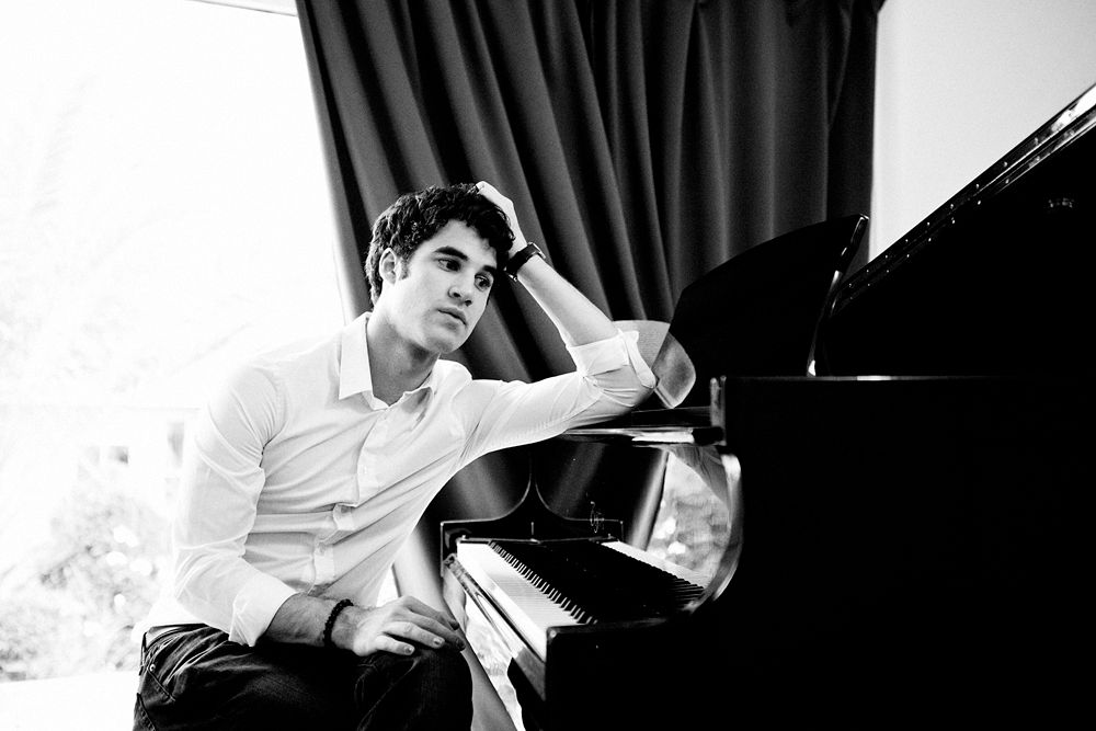
Jensen: This is good. And may just be your best photo yet. I love the setting and your expression works well for struggling musician. The quality seems grainy but that could be the B&W details. Very nicely done!
JY: I love your interpretation as a Musician. I think you nailed the theme well. Overall, I love this but be careful with the angle of your face. I don't think you looked as yummy as before within this angle.
Ayubot: PHOTOGRAPH ANALYSIS COMPLETE!
ANALYSIS:
FASHION CONTENT: 4
MODELLING CONTENT: 3
THEME CONNECTION: 5
EVALUATION: DARREN CRISS is emitting a lot of emotion in this picture.
AYUBOT definitely identifies DARREN CRISS as a struggling musician.
DARREN CRISS still looks relatively tall even though the photograph is cropped.
Fashion content moderate.
AREAS OF IMPROVEMENT:
More emphasis on fashion.
Sean: I don't see the same type of "struggling musician" in this photo that you do. I see an established musician who is struggling with a moment of songwriting rather than a musician who is struggling to make it. Still, that's just semantics because there is still 'struggling musician" in this photo. You have a great pose and great styling here. I agree with Ayubot that you do look tall in this photo, which is a nice change since Darren Criss is actually a pretty short guy (5'8" if I remember correctly). Good work.
Dave - Art Gallery Owner

Jensen: I like this, and I like that you wanted to use a more creative occupation, but don't diss the cowboys dude!!! I like your expression because it reads more cocky then pretty boy. Twice in a row you've stepped out of the norm for you and I like that. This is good. I don't really get ART gallery, but I get where you're going and I appreciate a risk.
JY: Sophisticated and real. I love the styling and I love your expression. I think you gave us something different this week. The setting is great as well. So good job, Dave.
Ayubot: PHOTOGRAPH ANALYSIS COMPLETE!
ANALYSIS:
FASHION CONTENT: 3
MODELLING CONTENT: 2
THEME CONNECTION: 5
EVALUATION: DAVE ANNABLE is pulchritudinous.
AYUBOT likes the expression, but the pose is bland.
The occupation is unique, and the idea is well executed.
The fashion content is low. Black shirt and pants are basic.
AREAS OF IMPROVEMENT:
Why not "eccentric gallery owner" with wild clothing?
Sean: Ok, so we can definitely see your theme in this shot; I'm just not liking your face here. I liked your goofy look during the Good & Evil week, but this time, I don't see the point in that expression and it doesn't help enhance the photo in any way for me. I think you're dressed appropriately for your chosen field and you made a good connection with the theme. Your face is just very off-putting this round and it's hard to say that since I always love seeing your face
Garrett - Boxer

Jensen: *hugs* thought you could use that after being robbed of first call out. This is good. I really like this. When I think back over the course of the game, there's three photos of yours I'd say were GREAT and this is one of them. I love the emotion, the pose, the obviousness and the bruises. The dirty greasy look is working for a sweaty boxer. Good job!!
JY: Another good week for you. I think it's so believable and real. I see a boxer here. The fashion is still there. The make-up is great. I love this, Garrett. I'm so proud of you Garrett. I want to see you again next round
Ayubot: PHOTOGRAPH ANALYSIS COMPLETE!
ANALYSIS:
FASHION CONTENT: 2
MODELLING CONTENT: 4
THEME CONNECTION: 4
EVALUATION: AYUBOT commends GARRETT HEDLUND for looking good with a black eye.
AYUBOT thinks GARRETT HEDLUND makes a very believable beaten up boxer.
AYUBOT likes the way the hair is styled.
AREAS OF IMPROVEMENT:
AYUBOT might like to see a more fashionable boxer.
Sean: Nice makeup job. You look like you spent some time in the ring, but you still look like you came out the victor. The gloves are a throwback to an older style in boxing that we don't really see anymore. Part of me likes that, but part of me would have rather seen you wear more modern gear in this shot. Still, you've made a good connection to your theme this round and you look good doing it.
Heechul - Fashion TV Reporter

Jensen: So, were you just waiting for the teams to end and then pull out all the stops? This is good. I really have nothing negative to say because I think this really works well. I haven't seen the rest yet but so far, this is my favourite of the round.
JY: A little bit upset because the desk kinda hide your style but I definitely see a fashion tv reporter here. I love your explanation but Kim's pregnant now so we should forgive her. The logo a little bit distracting but overall, you have another good week, Heechul.
Ayubot: PHOTOGRAPH ANALYSIS COMPLETE!
ANALYSIS:
FASHION CONTENT: 4
MODELLING CONTENT: 2
THEME CONNECTION: 3
EVALUATION: AYUBOT sees interviewer here, but not a fashion interviewer. Though fashion content is high.
AYUBOT does not like HEECHUL KIM's face.
AYUBOT does not like the hat or the desk, they are superfluous.
AREAS OF IMPROVEMENT:
AYUBOT would like to see HEECHUL KIM do more with his body.
Sean: Sorry Ayu, but I do see a fashion tv reporter here. And Heechul, where have you been this whole competition? I was at the point where I was wondering how you were still around and now these past two rounds, you've really brought out the big guns and are coming on strong. I love the styling this round, but not a biggest fan of the placement of your hat. That's really the only negative I have about this photo. I would have liked either a better angle for the hat or no hat at all. Otherwise, good work, Heechul.
Josh H - Undercover Cop

Jensen: This is good. It reminds me a bit of one of Liam's photos lol I like the shadows and the B&W, the gun. The styling. It all works great. You're a bit too shadowed, but it's not horrible.
JY: I love the intensity in this photo especially on your face. The concept is great. I think you looked a little bit short here, maybe because you chinned down your face here. But overall, I like this because it's unique.
Ayubot: PHOTOGRAPH ANALYSIS COMPLETE!
ANALYSIS:
FASHION CONTENT: 4
MODELLING CONTENT: 3
THEME CONNECTION: 3
EVALUATION: A Tuxedo is very fancy for an undercover cop.
The lighting works very well to bring out JOSH HUTCHERSON's features.
AYUBOT loves JOSH HUTCHERSON's face.
AYUBOT especially loves JOSH HUTCHERSON's jawline for once.
AREAS OF IMPROVEMENT:
A good model isn't short. Try to find photos where JOSH HUTCHERSON is taller.
Sean: I can see an undercover cop here. The gun in your hand is very subtle and had I not been looking at the photo for clues to your occupation, I might have missed it. I think the photo could have done well to have been larger and with a bit of space on each side cropped off (but not too much to where you'd lose the scene). I also would have liked a little more of an exciting shot this round. To me, there's not much to this photo that really grabs my attention. Still, it's a solid one and I'd be surprised if you're in trouble with it.
Liam - Professional Motorcycle Racer

Jensen: You look great, and you're modeling well. I love your pose and expression. The setting is great. But, there are flaws. GASP yes I said it. There are flaws with your photo. First, is the size. I'd love to see your gorgeous face more close up. But the biggest flaw, and honestly, I don't think it will hurt you much, but, you don't look like a bike racer. Maybe because of the way you're dressed. I"m not sure. But other than that, it's damn good and you know it.
JY: Yeah it's a good photo but I think you can work more on the styling. Not really a bike racer. I understand that you want to portray yourself during your day off but it would be better if we can see you doing your job.
Ayubot: PHOTOGRAPH ANALYSIS COMPLETE!
ANALYSIS:
FASHION CONTENT: 3
MODELLING CONTENT: 4
THEME CONNECTION: 1
EVALUATION: AYUBOT does not think LIAM HEMSWORTH makes a convincing biker.
Or a convincing professional motorcycle racer.
AYUBOT expected to see more emphasis on the professional part.
Biking jacket? Helmet?
AYUBOT sees a handsome man with a motorcycle.
AREAS OF IMPROVEMENT:
LIAM HEMSWORTH is modelling well, but one of his legs is hidden by the shadows. Disabled professional motorcycle racer?
Sean: It's not the strongest connection to the theme this round, but it's still there. I don't necessarily buy this as a shot of a motorcycle racer and it looks more like "motorcycle enthusiast" to me. Maybe it's the casual clothing rather than any type of racing gear that has me not making the connection to it being professional. Still, I like the way you're posed as it's showing off your fantastic body well. I just wish the shot was closer up on you so we could see more detail.
Stephen - Street Performer

Jensen: This is very sexy and very creative and very very unique. Not sure how much I love it though. You're holding yourself very well upside down and in mid air, but it's hard to see your features as much as I want to.
JY: This is risky because we can't see your face clearly but I'm so glad that you're trying something different this week. Really creative. You represent your job so well. Great job
Ayubot: PHOTOGRAPH ANALYSIS COMPLETE!
ANALYSIS:
FASHION CONTENT: 3
MODELLING CONTENT: 3
THEME CONNECTION: 4
EVALUATION: At least STEPHEN AMELL did not choose "archer".
AYUBOT sees a very talented street performer in this photograph.
The street fashion could be improved with some accessories.
The background works but overshadows.
AREAS OF IMPROVEMENT:
STEPHEN AMELL appears to be constipated.
Or about to vomit.
Even upside down, a flawless face is necessary.
Sean: I love how different this shot is. I don't care what other people say, street performer is an occupation and it's one that pays much better than anything I've ever done. I love how well-defined your muscles are in this shot. In many other shots, we can tell you have good muscle tone, but in this shot, we can see so much detail in them. Your face isn't as strong as it could be, but I'm not really that bothered by it. I would have liked a little bit better of an angle from this photo so we could see you better, but it's still a good shot, to me.
This week, you had to tell us about your second life through photos. We wanted you to come up with an alternate occupation and show us through a photograph, what it was.
Bradley - Newspaper Publisher/Editor in Chief

Jensen: What kind of blows here is that with your avatar and your photo, it's a throwback to Season 13's Bradley Cooper. He had that avatar (which I don't like btw lol go back to the original) and he submitted this photo. The good news is, he submitted it for high school clique and you have chosen a proper use for it lol I do see business man here. And the newspaper is a good touch because you look like you're reading over your daily paper to see how it looks. I like your pose and you look nice.
JY: I'm not a fan of you using the same photo but there's no rules about it yet, so it's okay. And I think your photo represent your job so well. I think it's a little bit boring. Probably because I saw this photo before but overall, it's good. I can see the publisher/editor here.
Ayubot: PHOTOGRAPH ANALYSIS COMPLETE!
ANALYSIS:
FASHION CONTENT: 4
MODELLING CONTENT: 2
THEME CONNECTION: 3
EVALUATION: AYUBOT is not excited by this picture.
The setting and the outfit is too casual for a newspaper editor.
AYUBOT sees a successful business man on his day off work, reading the newspaper.
The photo lacks a certain wow factor.
Positively, the fashion is good.
AREAS OF IMPROVEMENT:
Modelling content.
Atmosphere, setting to accentuate picture.
Sean: Personally, I don't care that this photo was used by the previous Bradley. Bradley Cooper was not off-limits and you personally had not submitted this photo before. I can see your occupation well enough here and you're very well-groomed and styled for that position. It's a little on the boring side, but that's my only real complaint with this shot.
Darren - Struggling Musician

Jensen: This is good. And may just be your best photo yet. I love the setting and your expression works well for struggling musician. The quality seems grainy but that could be the B&W details. Very nicely done!
JY: I love your interpretation as a Musician. I think you nailed the theme well. Overall, I love this but be careful with the angle of your face. I don't think you looked as yummy as before within this angle.
Ayubot: PHOTOGRAPH ANALYSIS COMPLETE!
ANALYSIS:
FASHION CONTENT: 4
MODELLING CONTENT: 3
THEME CONNECTION: 5
EVALUATION: DARREN CRISS is emitting a lot of emotion in this picture.
AYUBOT definitely identifies DARREN CRISS as a struggling musician.
DARREN CRISS still looks relatively tall even though the photograph is cropped.
Fashion content moderate.
AREAS OF IMPROVEMENT:
More emphasis on fashion.
Sean: I don't see the same type of "struggling musician" in this photo that you do. I see an established musician who is struggling with a moment of songwriting rather than a musician who is struggling to make it. Still, that's just semantics because there is still 'struggling musician" in this photo. You have a great pose and great styling here. I agree with Ayubot that you do look tall in this photo, which is a nice change since Darren Criss is actually a pretty short guy (5'8" if I remember correctly). Good work.
Dave - Art Gallery Owner

Jensen: I like this, and I like that you wanted to use a more creative occupation, but don't diss the cowboys dude!!! I like your expression because it reads more cocky then pretty boy. Twice in a row you've stepped out of the norm for you and I like that. This is good. I don't really get ART gallery, but I get where you're going and I appreciate a risk.
JY: Sophisticated and real. I love the styling and I love your expression. I think you gave us something different this week. The setting is great as well. So good job, Dave.
Ayubot: PHOTOGRAPH ANALYSIS COMPLETE!
ANALYSIS:
FASHION CONTENT: 3
MODELLING CONTENT: 2
THEME CONNECTION: 5
EVALUATION: DAVE ANNABLE is pulchritudinous.
AYUBOT likes the expression, but the pose is bland.
The occupation is unique, and the idea is well executed.
The fashion content is low. Black shirt and pants are basic.
AREAS OF IMPROVEMENT:
Why not "eccentric gallery owner" with wild clothing?
Sean: Ok, so we can definitely see your theme in this shot; I'm just not liking your face here. I liked your goofy look during the Good & Evil week, but this time, I don't see the point in that expression and it doesn't help enhance the photo in any way for me. I think you're dressed appropriately for your chosen field and you made a good connection with the theme. Your face is just very off-putting this round and it's hard to say that since I always love seeing your face

Garrett - Boxer

Jensen: *hugs* thought you could use that after being robbed of first call out. This is good. I really like this. When I think back over the course of the game, there's three photos of yours I'd say were GREAT and this is one of them. I love the emotion, the pose, the obviousness and the bruises. The dirty greasy look is working for a sweaty boxer. Good job!!
JY: Another good week for you. I think it's so believable and real. I see a boxer here. The fashion is still there. The make-up is great. I love this, Garrett. I'm so proud of you Garrett. I want to see you again next round
Ayubot: PHOTOGRAPH ANALYSIS COMPLETE!
ANALYSIS:
FASHION CONTENT: 2
MODELLING CONTENT: 4
THEME CONNECTION: 4
EVALUATION: AYUBOT commends GARRETT HEDLUND for looking good with a black eye.
AYUBOT thinks GARRETT HEDLUND makes a very believable beaten up boxer.
AYUBOT likes the way the hair is styled.
AREAS OF IMPROVEMENT:
AYUBOT might like to see a more fashionable boxer.
Sean: Nice makeup job. You look like you spent some time in the ring, but you still look like you came out the victor. The gloves are a throwback to an older style in boxing that we don't really see anymore. Part of me likes that, but part of me would have rather seen you wear more modern gear in this shot. Still, you've made a good connection to your theme this round and you look good doing it.
Heechul - Fashion TV Reporter

Jensen: So, were you just waiting for the teams to end and then pull out all the stops? This is good. I really have nothing negative to say because I think this really works well. I haven't seen the rest yet but so far, this is my favourite of the round.
JY: A little bit upset because the desk kinda hide your style but I definitely see a fashion tv reporter here. I love your explanation but Kim's pregnant now so we should forgive her. The logo a little bit distracting but overall, you have another good week, Heechul.
Ayubot: PHOTOGRAPH ANALYSIS COMPLETE!
ANALYSIS:
FASHION CONTENT: 4
MODELLING CONTENT: 2
THEME CONNECTION: 3
EVALUATION: AYUBOT sees interviewer here, but not a fashion interviewer. Though fashion content is high.
AYUBOT does not like HEECHUL KIM's face.
AYUBOT does not like the hat or the desk, they are superfluous.
AREAS OF IMPROVEMENT:
AYUBOT would like to see HEECHUL KIM do more with his body.
Sean: Sorry Ayu, but I do see a fashion tv reporter here. And Heechul, where have you been this whole competition? I was at the point where I was wondering how you were still around and now these past two rounds, you've really brought out the big guns and are coming on strong. I love the styling this round, but not a biggest fan of the placement of your hat. That's really the only negative I have about this photo. I would have liked either a better angle for the hat or no hat at all. Otherwise, good work, Heechul.
Josh H - Undercover Cop

Jensen: This is good. It reminds me a bit of one of Liam's photos lol I like the shadows and the B&W, the gun. The styling. It all works great. You're a bit too shadowed, but it's not horrible.
JY: I love the intensity in this photo especially on your face. The concept is great. I think you looked a little bit short here, maybe because you chinned down your face here. But overall, I like this because it's unique.
Ayubot: PHOTOGRAPH ANALYSIS COMPLETE!
ANALYSIS:
FASHION CONTENT: 4
MODELLING CONTENT: 3
THEME CONNECTION: 3
EVALUATION: A Tuxedo is very fancy for an undercover cop.
The lighting works very well to bring out JOSH HUTCHERSON's features.
AYUBOT loves JOSH HUTCHERSON's face.
AYUBOT especially loves JOSH HUTCHERSON's jawline for once.
AREAS OF IMPROVEMENT:
A good model isn't short. Try to find photos where JOSH HUTCHERSON is taller.
Sean: I can see an undercover cop here. The gun in your hand is very subtle and had I not been looking at the photo for clues to your occupation, I might have missed it. I think the photo could have done well to have been larger and with a bit of space on each side cropped off (but not too much to where you'd lose the scene). I also would have liked a little more of an exciting shot this round. To me, there's not much to this photo that really grabs my attention. Still, it's a solid one and I'd be surprised if you're in trouble with it.
Liam - Professional Motorcycle Racer

Jensen: You look great, and you're modeling well. I love your pose and expression. The setting is great. But, there are flaws. GASP yes I said it. There are flaws with your photo. First, is the size. I'd love to see your gorgeous face more close up. But the biggest flaw, and honestly, I don't think it will hurt you much, but, you don't look like a bike racer. Maybe because of the way you're dressed. I"m not sure. But other than that, it's damn good and you know it.
JY: Yeah it's a good photo but I think you can work more on the styling. Not really a bike racer. I understand that you want to portray yourself during your day off but it would be better if we can see you doing your job.
Ayubot: PHOTOGRAPH ANALYSIS COMPLETE!
ANALYSIS:
FASHION CONTENT: 3
MODELLING CONTENT: 4
THEME CONNECTION: 1
EVALUATION: AYUBOT does not think LIAM HEMSWORTH makes a convincing biker.
Or a convincing professional motorcycle racer.
AYUBOT expected to see more emphasis on the professional part.
Biking jacket? Helmet?
AYUBOT sees a handsome man with a motorcycle.
AREAS OF IMPROVEMENT:
LIAM HEMSWORTH is modelling well, but one of his legs is hidden by the shadows. Disabled professional motorcycle racer?
Sean: It's not the strongest connection to the theme this round, but it's still there. I don't necessarily buy this as a shot of a motorcycle racer and it looks more like "motorcycle enthusiast" to me. Maybe it's the casual clothing rather than any type of racing gear that has me not making the connection to it being professional. Still, I like the way you're posed as it's showing off your fantastic body well. I just wish the shot was closer up on you so we could see more detail.
Stephen - Street Performer

Jensen: This is very sexy and very creative and very very unique. Not sure how much I love it though. You're holding yourself very well upside down and in mid air, but it's hard to see your features as much as I want to.
JY: This is risky because we can't see your face clearly but I'm so glad that you're trying something different this week. Really creative. You represent your job so well. Great job
Ayubot: PHOTOGRAPH ANALYSIS COMPLETE!
ANALYSIS:
FASHION CONTENT: 3
MODELLING CONTENT: 3
THEME CONNECTION: 4
EVALUATION: At least STEPHEN AMELL did not choose "archer".
AYUBOT sees a very talented street performer in this photograph.
The street fashion could be improved with some accessories.
The background works but overshadows.
AREAS OF IMPROVEMENT:
STEPHEN AMELL appears to be constipated.
Or about to vomit.
Even upside down, a flawless face is necessary.
Sean: I love how different this shot is. I don't care what other people say, street performer is an occupation and it's one that pays much better than anything I've ever done. I love how well-defined your muscles are in this shot. In many other shots, we can tell you have good muscle tone, but in this shot, we can see so much detail in them. Your face isn't as strong as it could be, but I'm not really that bothered by it. I would have liked a little bit better of an angle from this photo so we could see you better, but it's still a good shot, to me.





 but thanks for saving me judges, bye Brad! Congrats Garrett <3


