Post by Sean Maher on Apr 7, 2013 23:39:23 GMT -5
Hello Models!
This week we wanted to see you all express your artistic side through fashion.
Darren - Ghost
Jensen: I see ghost in this. The quality and lighting makes you seem almost see through. The quality is not the best but that's minor for me. I like your pose but you need to keep your face fierce, it looks kind of odd here, might be on purpose though.
Ayubot: PHOTOGRAPH ANALYSIS COMPLETE!
ANALYSIS:
FASHION CONTENT: 5
MODELLING CONTENT: 4
ARTISTIC FLAIR: 3
EVALUATION: AYUBOT does not see this photograph as very ARTISTIC. Though it could work as a painting, for AYUBOT this is a regular FASHION photograph with some cool EFFECTS.
AYUBOT is not entirely sold on the face, and perhaps a more exaggerated expression would work.
AREAS OF IMPROVEMENT:
Be aware of the face.
More artistic flair. A bit more surrealism.
JY: The effect is beautiful. I love your styling so much. Very striking and cool. The concept is there. I'm still worried for you though, but mainly because of your lateness. I hope it's not going to affect your position much in this game.
Sean: It could just be a filter, but the quality looks off to me. It's an interesting pose and I think your description was pretty smart. You saw the retro styling and the filters and came up with a good reason as to why you'd be dressed like that. I think you've gotten the "Fashion" part of this photo down well, but I'm not sure I fully see it as "Art" here. I do see some artistic value in the photo, though.
Dave - The Decision

Jensen: I like this a lot. And I probably have a million reasons why. The lighting, the pose, the expression, your face, the shadows. It's all very artistic. I have nothing negative to say.
Ayubot: PHOTOGRAPH ANALYSIS COMPLETE!
ANALYSIS:
FASHION CONTENT: 3
MODELLING CONTENT: 3
ARTISTIC FLAIR: 5
EVALUATION: The LIGHTING provides an excellent contrast and helps bring out the features of DAVE ANNABLE.
The LIGHTING also provides ARTISTIC FLAIR to this photograph.
FASHION is present, but the focus.
MODELLING is basic, but it works.
AREAS OF IMPROVEMENT:
Bring a bit more fashion into your photographs.
JY: This is a great B&W shot. And the lighting in this photo made the photo look even edgier. I think this is totally different from what we've seen from you before. Good job. Very artistic. I love this
Sean: I love the lighting in this photo and the lines it's creating here. I agree with the other judges that it's adding a nice artistic flair to the photo. It's not a total home run this time cause there could still stand to be more to this photo. More fashion or modeling content as Ayubot would point out, but as it is, it's still a really strong photo.
Garrett - MajesticDaint

Jensen: This is a beautiful shot. The lighting is fantastic, your profile is gorgeous. Like Heechul, I feel like you waited for the teams to end to bring out the big guns. I've been nothing but impressed with you lately. Your expression and face are just mesmerizing. The cigarette smoke is also a nice touch, the way it's flying over your hand. This is beautiful.
Ayubot: PHOTOGRAPH ANALYSIS COMPLETE!
ANALYSIS:
FASHION CONTENT: 4
MODELLING CONTENT: 3
ARTISTIC FLAIR: 3
EVALUATION: AYUBOT is not convinced on the ARTISTIC FLAIR in this photograph.
GARRETT HEDLUND's profile is indeed beautiful.
The FASHION CONTENT is solid.
MODELLING is basic, but acceptable.
AREAS OF IMPROVEMENT:
Remember to bring more modelling content. You are improving.
JY: Your profile is gorgeous. You look great and your bones structure are so sexy!!! I love the fashion. I think you can work more on the artistic side, but the lighting really help this photo a lot.
Sean: The theme is hard to nail down this week since what is art to one person may not be very artistic to another. To me, I see this as a fantastic shot of you, but not really so much as a "Fashion as Art" shot. You are showing off a good amount of fashion is this shot, so at least that's nice. You do have a wonderful profile, too.
Heechul - On The Bubble

Jensen: I wish you would have done some cropping because I'm a bit overwhelmed by the colouring of the photo. That being said, I like this. There's so much going on but your face is very strong and nice that I'm not TOO overwhelmed by everything.
Ayubot: PHOTOGRAPH ANALYSIS COMPLETE!
ANALYSIS:
FASHION CONTENT: 5
MODELLING CONTENT: 5
ARTISTIC FLAIR: 5
EVALUATION: FULL MARKS from AYUBOT this photoshoot, HEECHUL KIM.
This PHOTOGRAPH has everything AYUBOT was looking for in this photoshoot.
Though this is mostly a HEAD SHOT, the modelling is still present, and very strong.
FASHION CONTENT is unbelievably strong, and AYUBOT likes the accessories.
AREAS OF IMPROVEMENT:
Try not to include WATERMARKS in photographs. SOME JUDGES find them too distracting and rank you off the watermark instead of the photograph.
JY: I know how hard it's to remove the watermark, but I still think you can remove the logo at the upper and bottom of this photo. It's really easy to crop it. I want you to explain more on your photo too. Other than that, fantastic. This is weird but in a good way. I love the angle and how perfect the title is to your photo.
Sean: Ok, when I saw this shot on my phone, I hated it. Now that I'm home and on my computer, I can see detail better and I'm liking this shot a bit more. The watermarks are a little distracting, but they're blended well enough that they're not overly distracting. I see a decent amount of artistic value in this shot and while I don't particularly care for your face in this shot, it does have some redeeming qualities to it; namely, your skin.
Josh H - Lost Boy

Jensen: There is definitely a story behind this photo. I see it. You're emoting beautifully and that's great. The colouring and your pose are pure sadness. This is good.
Ayubot: PHOTOGRAPH ANALYSIS COMPLETE!
ANALYSIS:
FASHION CONTENT: 4
MODELLING CONTENT: 3
ARTISTIC FLAIR: 3
EVALUATION: ERROR: THERE IS ONLY ENOUGH ROOM FOR ONE ROBOT HERE.
AYUBOT computes that since JOSHBOT nearly crashed, his system is inferior.
FASHION CONTENT is present in the photograph, and is almost perfect.
JOSHBOT appears short in this photograph. BEING a CUSTOM MADE ROBOT, AYUBOT doesn't understand why JOSH HUTCHERSON didn't preorder HEIGHT.
This PHOTOGRAPH is somewhat ARTISTIC, but could be improved.
AREAS OF IMPROVEMENT:
REMOVE JOSHBOT FROM EXISTENCE!
JY: I really like this photo alone. So quirky and cute but I want to see the artistic side more. I think you look great Josh. The fashion is strong. Overall, it's not bad but I know you can do better than this.
Sean: Josh, please watch how you treat Ayubot. If you cause too many errors in her programming, I'll have to go repair her again and you'll be stuck with Seanbot again. In any event, you have the opposite problem that Heechul had. When I saw this photo over my phone, I absolutely loved it. Now that I'm home and seeing it on my computer with better detail, I'm not as big of a fan of it. However, I still like your shot. For the most part, I really like your pose. The only negative I have about it is that you're a little too scrunched and it's making your body look a bit shorter than it already is. I do see some artistic value in this shot, so that's nice. Overall, this is a strong effort and a step up from last round.
Liam - Lonely Lover

Jensen: This looks like a painting and like Josh, there's a story in this picture. I like that. The quality is off, but in looking like a painting it really doesn't hurt at all. The shadows aren't necessarily working in your favour here, as you're so far away for me, but on the whole, I like this.
Ayubot: PHOTOGRAPH ANALYSIS COMPLETE!
ANALYSIS:
FASHION CONTENT: 4
MODELLING CONTENT: 3
ARTISTIC FLAIR: 4
EVALUATION: AYUBOT compares similarities to WHISTLER'S MOTHER in this photograph. AYUBOT is now ACCESSING her DATABASE for an image of said painting.
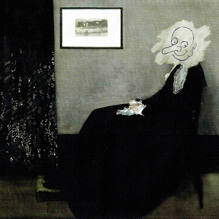
PERFECT MATCH.
FASHION CONTENT is present, but not exciting for AYUBOT.
MODELLING CONTENT is basic, and could be improved, but AYUBOT thinks it works in this case.
AREAS OF IMPROVEMENT:
Bring a bit more focus to fashion and modelling.
JY: Simple and gorgeous. Very artistic and creative but I agree with Ayubot. You can do better especially on your fashion and modeling cause it's pretty basic here. But overall, I don't think you have anything to worry this week. Great job, Liam
Sean: This is definitely art, but it's not fully "Fashion as Art". I agree with Ayubot about this being photo being eerily reminiscent of Whistler's Mother and that really helps out on the art end of the spectrum. Like Jensen, I also appreciate that there's an obvious story behind your photo. Overall, it's a really strong shot that just needed a bit more of a fashion element to it this round.
Stephen - The Possession of Greed

Jensen: Hmmmm photo shoot reuses are fine if you can make them completely different from each other. I'm not sure how I feel here. I love this photo of you and the green colouring is working well for you. I definitely find it fits with your title for sure as well. I think I would love this if we hadn't seen it before. I know there ARE differences, dont' get me wrong, but there's too many similarities as well.
Ayubot: PHOTOGRAPH ANALYSIS COMPLETE!
ANALYSIS:
FASHION CONTENT: 3
MODELLING CONTENT: 3
ARTISTIC FLAIR: 4
EVALUATION: "THE POSSESSION OF GREED" is a very suitable title for this photograph, and works well in adding a STORY and ARTISTIC FLAIR.
FASHION and MODELLING CONTENT is basic, and could be improved, but the MODELLING is suited for this photograph.
AREAS OF IMPROVEMENT:
JENSEN gave good advice on PHOTOSHOOT reusing. AYUBOT doesn't mind, but OTHER JUDGES might.
JY: I don't blame you, Jensen cause I thought I've seen this photo too. But it's definitely not the same photo. As far as the photo from the same photoshoot, I don't mind but make sure it's slightly different in term of the styling and setting. Back to your photo, I think this would be better in B&W to inject the artistic mood more but we're not going to see the green color then, so it's okay. Overall, I think this is good and your title is perfect but I want to see something unexpected from you.
Sean: Your description is really what makes this shot for me. Without it, there's some artistic value, but not much. When you add the title "Possession of Greed", that's when it really takes shape for me. I agree with the other judges that it does look a lot like a shot from a previous shoot, but there are some subtle styling differences that show that it's not from the same actual shoot. I love your facial hair in this shot; it has just the perfect length and it's groomed wonderfully. I'm also loving your eyes. Not only are they just naturally beautiful, but the intensity you're giving us through them matches the theme of the photo itself.
This week we wanted to see you all express your artistic side through fashion.
Darren - Ghost
Jensen: I see ghost in this. The quality and lighting makes you seem almost see through. The quality is not the best but that's minor for me. I like your pose but you need to keep your face fierce, it looks kind of odd here, might be on purpose though.
Ayubot: PHOTOGRAPH ANALYSIS COMPLETE!
ANALYSIS:
FASHION CONTENT: 5
MODELLING CONTENT: 4
ARTISTIC FLAIR: 3
EVALUATION: AYUBOT does not see this photograph as very ARTISTIC. Though it could work as a painting, for AYUBOT this is a regular FASHION photograph with some cool EFFECTS.
AYUBOT is not entirely sold on the face, and perhaps a more exaggerated expression would work.
AREAS OF IMPROVEMENT:
Be aware of the face.
More artistic flair. A bit more surrealism.
JY: The effect is beautiful. I love your styling so much. Very striking and cool. The concept is there. I'm still worried for you though, but mainly because of your lateness. I hope it's not going to affect your position much in this game.
Sean: It could just be a filter, but the quality looks off to me. It's an interesting pose and I think your description was pretty smart. You saw the retro styling and the filters and came up with a good reason as to why you'd be dressed like that. I think you've gotten the "Fashion" part of this photo down well, but I'm not sure I fully see it as "Art" here. I do see some artistic value in the photo, though.
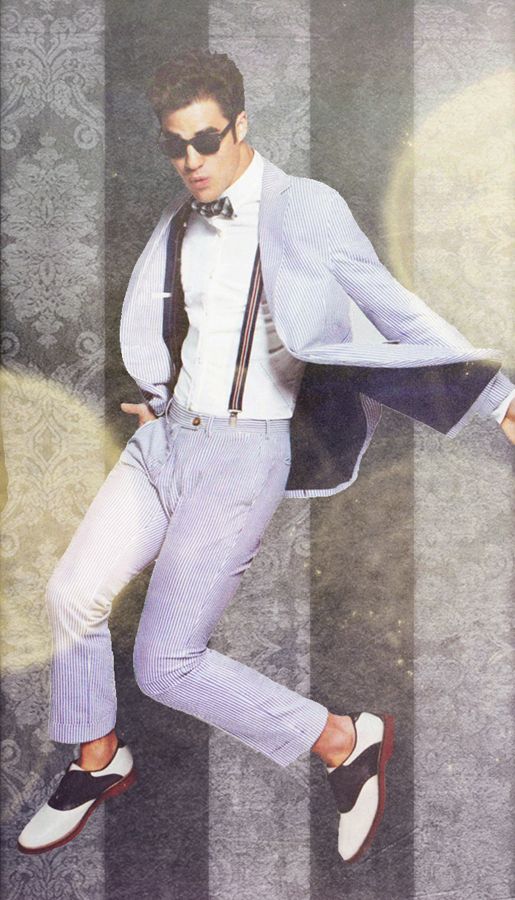
Dave - The Decision
Jensen: I like this a lot. And I probably have a million reasons why. The lighting, the pose, the expression, your face, the shadows. It's all very artistic. I have nothing negative to say.
Ayubot: PHOTOGRAPH ANALYSIS COMPLETE!
ANALYSIS:
FASHION CONTENT: 3
MODELLING CONTENT: 3
ARTISTIC FLAIR: 5
EVALUATION: The LIGHTING provides an excellent contrast and helps bring out the features of DAVE ANNABLE.
The LIGHTING also provides ARTISTIC FLAIR to this photograph.
FASHION is present, but the focus.
MODELLING is basic, but it works.
AREAS OF IMPROVEMENT:
Bring a bit more fashion into your photographs.
JY: This is a great B&W shot. And the lighting in this photo made the photo look even edgier. I think this is totally different from what we've seen from you before. Good job. Very artistic. I love this
Sean: I love the lighting in this photo and the lines it's creating here. I agree with the other judges that it's adding a nice artistic flair to the photo. It's not a total home run this time cause there could still stand to be more to this photo. More fashion or modeling content as Ayubot would point out, but as it is, it's still a really strong photo.
Garrett - MajesticDaint
Jensen: This is a beautiful shot. The lighting is fantastic, your profile is gorgeous. Like Heechul, I feel like you waited for the teams to end to bring out the big guns. I've been nothing but impressed with you lately. Your expression and face are just mesmerizing. The cigarette smoke is also a nice touch, the way it's flying over your hand. This is beautiful.
Ayubot: PHOTOGRAPH ANALYSIS COMPLETE!
ANALYSIS:
FASHION CONTENT: 4
MODELLING CONTENT: 3
ARTISTIC FLAIR: 3
EVALUATION: AYUBOT is not convinced on the ARTISTIC FLAIR in this photograph.
GARRETT HEDLUND's profile is indeed beautiful.
The FASHION CONTENT is solid.
MODELLING is basic, but acceptable.
AREAS OF IMPROVEMENT:
Remember to bring more modelling content. You are improving.
JY: Your profile is gorgeous. You look great and your bones structure are so sexy!!! I love the fashion. I think you can work more on the artistic side, but the lighting really help this photo a lot.
Sean: The theme is hard to nail down this week since what is art to one person may not be very artistic to another. To me, I see this as a fantastic shot of you, but not really so much as a "Fashion as Art" shot. You are showing off a good amount of fashion is this shot, so at least that's nice. You do have a wonderful profile, too.
Heechul - On The Bubble
Jensen: I wish you would have done some cropping because I'm a bit overwhelmed by the colouring of the photo. That being said, I like this. There's so much going on but your face is very strong and nice that I'm not TOO overwhelmed by everything.
Ayubot: PHOTOGRAPH ANALYSIS COMPLETE!
ANALYSIS:
FASHION CONTENT: 5
MODELLING CONTENT: 5
ARTISTIC FLAIR: 5
EVALUATION: FULL MARKS from AYUBOT this photoshoot, HEECHUL KIM.
This PHOTOGRAPH has everything AYUBOT was looking for in this photoshoot.
Though this is mostly a HEAD SHOT, the modelling is still present, and very strong.
FASHION CONTENT is unbelievably strong, and AYUBOT likes the accessories.
AREAS OF IMPROVEMENT:
Try not to include WATERMARKS in photographs. SOME JUDGES find them too distracting and rank you off the watermark instead of the photograph.
JY: I know how hard it's to remove the watermark, but I still think you can remove the logo at the upper and bottom of this photo. It's really easy to crop it. I want you to explain more on your photo too. Other than that, fantastic. This is weird but in a good way. I love the angle and how perfect the title is to your photo.
Sean: Ok, when I saw this shot on my phone, I hated it. Now that I'm home and on my computer, I can see detail better and I'm liking this shot a bit more. The watermarks are a little distracting, but they're blended well enough that they're not overly distracting. I see a decent amount of artistic value in this shot and while I don't particularly care for your face in this shot, it does have some redeeming qualities to it; namely, your skin.
Josh H - Lost Boy
Jensen: There is definitely a story behind this photo. I see it. You're emoting beautifully and that's great. The colouring and your pose are pure sadness. This is good.
Ayubot: PHOTOGRAPH ANALYSIS COMPLETE!
ANALYSIS:
FASHION CONTENT: 4
MODELLING CONTENT: 3
ARTISTIC FLAIR: 3
EVALUATION: ERROR: THERE IS ONLY ENOUGH ROOM FOR ONE ROBOT HERE.
AYUBOT computes that since JOSHBOT nearly crashed, his system is inferior.
FASHION CONTENT is present in the photograph, and is almost perfect.
JOSHBOT appears short in this photograph. BEING a CUSTOM MADE ROBOT, AYUBOT doesn't understand why JOSH HUTCHERSON didn't preorder HEIGHT.
This PHOTOGRAPH is somewhat ARTISTIC, but could be improved.
AREAS OF IMPROVEMENT:
REMOVE JOSHBOT FROM EXISTENCE!
JY: I really like this photo alone. So quirky and cute but I want to see the artistic side more. I think you look great Josh. The fashion is strong. Overall, it's not bad but I know you can do better than this.
Sean: Josh, please watch how you treat Ayubot. If you cause too many errors in her programming, I'll have to go repair her again and you'll be stuck with Seanbot again. In any event, you have the opposite problem that Heechul had. When I saw this photo over my phone, I absolutely loved it. Now that I'm home and seeing it on my computer with better detail, I'm not as big of a fan of it. However, I still like your shot. For the most part, I really like your pose. The only negative I have about it is that you're a little too scrunched and it's making your body look a bit shorter than it already is. I do see some artistic value in this shot, so that's nice. Overall, this is a strong effort and a step up from last round.
Liam - Lonely Lover
Jensen: This looks like a painting and like Josh, there's a story in this picture. I like that. The quality is off, but in looking like a painting it really doesn't hurt at all. The shadows aren't necessarily working in your favour here, as you're so far away for me, but on the whole, I like this.
Ayubot: PHOTOGRAPH ANALYSIS COMPLETE!
ANALYSIS:
FASHION CONTENT: 4
MODELLING CONTENT: 3
ARTISTIC FLAIR: 4
EVALUATION: AYUBOT compares similarities to WHISTLER'S MOTHER in this photograph. AYUBOT is now ACCESSING her DATABASE for an image of said painting.
PERFECT MATCH.
FASHION CONTENT is present, but not exciting for AYUBOT.
MODELLING CONTENT is basic, and could be improved, but AYUBOT thinks it works in this case.
AREAS OF IMPROVEMENT:
Bring a bit more focus to fashion and modelling.
JY: Simple and gorgeous. Very artistic and creative but I agree with Ayubot. You can do better especially on your fashion and modeling cause it's pretty basic here. But overall, I don't think you have anything to worry this week. Great job, Liam
Sean: This is definitely art, but it's not fully "Fashion as Art". I agree with Ayubot about this being photo being eerily reminiscent of Whistler's Mother and that really helps out on the art end of the spectrum. Like Jensen, I also appreciate that there's an obvious story behind your photo. Overall, it's a really strong shot that just needed a bit more of a fashion element to it this round.
Stephen - The Possession of Greed
Jensen: Hmmmm photo shoot reuses are fine if you can make them completely different from each other. I'm not sure how I feel here. I love this photo of you and the green colouring is working well for you. I definitely find it fits with your title for sure as well. I think I would love this if we hadn't seen it before. I know there ARE differences, dont' get me wrong, but there's too many similarities as well.
Ayubot: PHOTOGRAPH ANALYSIS COMPLETE!
ANALYSIS:
FASHION CONTENT: 3
MODELLING CONTENT: 3
ARTISTIC FLAIR: 4
EVALUATION: "THE POSSESSION OF GREED" is a very suitable title for this photograph, and works well in adding a STORY and ARTISTIC FLAIR.
FASHION and MODELLING CONTENT is basic, and could be improved, but the MODELLING is suited for this photograph.
AREAS OF IMPROVEMENT:
JENSEN gave good advice on PHOTOSHOOT reusing. AYUBOT doesn't mind, but OTHER JUDGES might.
JY: I don't blame you, Jensen cause I thought I've seen this photo too. But it's definitely not the same photo. As far as the photo from the same photoshoot, I don't mind but make sure it's slightly different in term of the styling and setting. Back to your photo, I think this would be better in B&W to inject the artistic mood more but we're not going to see the green color then, so it's okay. Overall, I think this is good and your title is perfect but I want to see something unexpected from you.
Sean: Your description is really what makes this shot for me. Without it, there's some artistic value, but not much. When you add the title "Possession of Greed", that's when it really takes shape for me. I agree with the other judges that it does look a lot like a shot from a previous shoot, but there are some subtle styling differences that show that it's not from the same actual shoot. I love your facial hair in this shot; it has just the perfect length and it's groomed wonderfully. I'm also loving your eyes. Not only are they just naturally beautiful, but the intensity you're giving us through them matches the theme of the photo itself.