

Post by Jae Yoo on Mar 20, 2013 12:27:39 GMT -5
Hello Models!!!
This week, you need to submit a magazine cover. Let's see your photo this week.
Team Hangovers

Jensen: Beautiful!!! Your beautiful eyes just mesmerize me. It's a tad large but I see you posted via mobile, so I won't bitch about it lol This is beautiful.
Ayubot: MAGAZINE COVER ANALYSIS COMPLETE!
ANALYSIS:
FASHION CONTENT: 4
MODELLING CONTENT: 4
MAGAZINE APPEAL: 4
EVALUATION: AYUBOT feels mesmerised by BRADLEY COOPER's eyes. AYUBOT notes that the size isn't too big, it falls between the size requirements. AYUBOT feels this is a good beauty shot, and captures AYUBOT's interests.
AREAS OF IMPROVEMENT:
AYUBOT thinks a full body shot would better show the fashion.
Sean: Such a classy shot. I love your eyes and your skin looks fantastic in this shot. It's a simple, classy shot that fits with your magazine's vibe perfectly.
Sean: Oh Gosh.. Love your eyes. Very beautiful. I think you do look great. I'm not sure if the whole cover is fantastic but this is far from bad. No matter what, you gave another solid photo. Good job
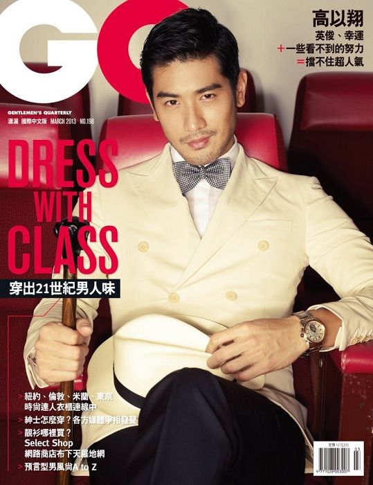
Jensen: I like this Godfrey!! I think you look debonair and lovely at the same time. Your expression is sexy, your face is what's so lovely here and then the outfit and pose give you class, a total GQ man for sure!!!
Sean: Dress with class? You've got that covered; very appropriate. I'm loving that evil little smirk you have on your face and your body language is just enhancing what you're going for here. Good work, Godfrey.
Ayubot: MAGAZINE COVER ANALYSIS COMPLETE!
ANALYSIS:
FASHION CONTENT: 5
MODELLING CONTENT: 4
MAGAZINE APPEAL: 4
EVALUATION: AYUBOT likes GODFREY GAO's smug expression, especially when combined with his outfit. AYUBOT finds his fashion very nice, and likes the combination of the white jacket with the bowtie.
AREAS OF IMPROVEMENT:
AYUBOT wants to see perhaps a standing shot wearing the hat. That might be in the spread though. That makes AYUBOT want to read the magazine for the spread. AYUBOT is rather pleased. No further complaints.
JY: I love it especially your styling in this photo. You made the bow tie looked good. Overall, this is my favorite photo from you so far. Great job!!!

Ayubot: MAGAZINE COVER ANALYSIS COMPLETE!
ANALYSIS:
FASHION CONTENT: 4
MODELLING CONTENT: 2
MAGAZINE APPEAL: 3
EVALUATION: AYUBOT commends HEECHUL KIM for taking on her advice, now the next problem is photo choice. According to AYUBOT's databank on HEECHUL KIM, the correct shoot was used, but not the photo. AYUBOT's databank on Seventeen Magazine denotes a very distinct style of photo used. This photo is almost there, but not quite. The styling is too formal for Seventeen. The problem of this photograph lies in the face.
AREAS OF IMPROVEMENT:
Eye contact in a magazine cover is a good way to bring in potential readers.
Jensen: I'd like to first note that only two judges asked you to embrace your femininity lol This photo is almost there. I'm not going to diss on the eye contact because it works ok, but I dont' like the biting of the lip or whatever you're doing. While yes, Seventeen is not as formal as the photo, your hair makes it less formal. The quirkiness is Seventeen but the mouth is just not working for me.
Sean: I do like that you're embracing a more effeminate look since I feel like the first two rounds, you choosing photos where you were trying to look masculine was not getting you very high rankings. I'm not a big fan of this particular cover, though. I am looking through your portfolio and I do see you have one pretty good cover you could have used, but I understand why you went this route since both Ayubot and I had told you to embrace your androgyny and the other cover I found would not have fit that criteria. Perhaps it's my fault for not stating it correctly. I would like to see you not be afraid of embracing your femininity, not necessarily just choose the most feminine photo. In any event, the positives in this cover is that I do feel that you are matching the vibe of magazine with your posture and expression (even if I'm not a big fan of it). The suit doesn't really fit in with the magazine, but it fits in with your styling, so that's a nice touch.
JY: I think I knew which cover that Sean talked about cause I'm hoping for that one too. But this isn't bad. I don't know there's a cover creator for Seventeen magazine cause I made a cover for Seventeen magazine too recently but using different site and I think your cover looks better than mine. I love how you bit your lips cause it's sexy!!!

Jensen: As with your reward choice, I am totally impressed this round. The photo quality doesn't seem 100% up to par but at this moment, I don't care. I think this is great! I love your connection with me (the camera lol) and I like the pose. Good job Watson!
Sean: As Jensen said, the photo quality may not be the best, but at this point, I don't care. Way to come back this round cause the pose, styling, expression, and vibe are all fantastic. While your eyes aren't as bright here as they were last round, they're still beautiful.
Ayubot: MAGAZINE COVER ANALYSIS COMPLETE!
ANALYSIS:
FASHION CONTENT: 4
MODELLING CONTENT: 3
MAGAZINE APPEAL: 4
EVALUATION: AYUBOT finds the tie is quite messy, but does mesh well with the messy informal vibe in the cover. Eye contact is made very well, it can bring in the readers.
AREAS OF IMPROVEMENT:
Beware of looking too aged. Though JUDE LAW does look younger than in previous shoots, he still looks quite aged.
JY: Million miles better than last round. I love your style. I don't think you look aged here. I love the way you were smizing with your eyes. Great job, Jude!!!

Jensen: Was this your choice or your team's choice? It's not the photo I saw and loved that you originally posted. I found your team kind of dissed on Justin's choices too but your team's choices for him were not good lmfao. Good news though. I like this photo. It's classy, it's fierce, you look amazing. And you look successful, like your Mag cover says. I think you look modelesque and handsome! Good job.
Sean: I hate the font on your cover; it looks pretty messy and a little hard to read. Still, you have a nice pose and your body language is a nice match to the title of your magazine. The styling's also fairly spot-on, too. This is a nice solid shot, but there's not really much to get excited about here (for me). I would imagine that you should be safe with this shot, though.
Ayubot: MAGAZINE COVER ANALYSIS COMPLETE!
ANALYSIS:
FASHION CONTENT: 4
MODELLING CONTENT: 2
MAGAZINE APPEAL: 2
EVALUATION: In this case, AYUBOT would have advised not to listen to your team members. AYUBOT finds this cover to be worse than the cover you originally chose. Though the fashion content of this cover is good.
AREAS OF IMPROVEMENT:
Take your own initiative. Sometimes your own choice is the best. Remember to consider your team members critiques, but the end, go with your gut.
JY: I'm not sure about this at all. I agree with Ayu-bot.. This is worse than your original choice. The cover is plain and unattractive.... I'm worried for you, Misha

Ayubot: MAGAZINE COVER ANALYSIS COMPLETE!
ANALYSIS:
FASHION CONTENT: 4
MODELLING CONTENT: 5
MAGAZINE APPEAL: 4
EVALUATION: The intense eye contact brings AYUBOT into the cover. AYUBOT thinks the way the facial hair shapes STEPHEN AMELL's face is flawless. As a magazine cover, AYUBOT feels drawn in by the eyes. However, AYUBOT prefers to have a preview of magazine content in a cover. This is a minor qualm.
AREAS OF IMPROVEMENT:
The hand looks a weird in relativity to the face. It brings the attention away from the face.
Jensen: Love this! I dont' know what else to say. I'm so glad you used it despite it being your avatar because darling, your avatar is HOT!! I agree with everything Ayubot is saying to you!
Sean: Well, it's a good thing for you that your only magazine cover is still pretty good. You've giving off such a strong, masculine vibe in this shot and I'm loving your intensity. Your styling (from the suit to your facial hair) is wonderful and your hand placement is just a nice added touch. Sometimes, it's something as small as your hand positioning that can really enhance a photo.
JY: Great choice, Stephen. You're so lucky. This is definitely your best photo in this competition. Very intense, sexy and flirty. Which is definitely great considering we have so many horny people in this competition.
Team Seven Deadly Sins

Jensen: I am glad you are trying for more variety. That right there will win me over. Love the high fashion suit and setting. Your expression is not very good, but I can look past that. Your pose is not bad and I like your hair. Overall, not a bad performance.
Ayubot: MAGAZINE COVER ANALYSIS COMPLETE!
ANALYSIS:
FASHION CONTENT: 5
MODELLING CONTENT: 3
MAGAZINE APPEAL: 1
EVALUATION: Why didn't DARREN CRISS submit a magazine cover? AYUBOT's database indicates DARREN CRISS has plenty of strong magazine covers that he could use. AYUBOT can find no excuse not to use a cover over a spread, AYUBOT's database indicates DARREN CRISS has only been in cycle 1.
AYUBOT thinks the fashion is extraordinarily good, but feels the modelling brings it down. The face is not to AYUBOT's standard.
AREAS OF IMPROVEMENT:
Explore your magazine covers, and utilise your team mates.
Sean: I would have preferred to have seen a cover from you this round since you do have some good ones to use. And this is not a new point coming from me. I posted last Cycle my views on this round and you commented with your own, referencing what I had said. Also, last time you were a player in this series, you got the same critique from 3/4 judges (the fifth didn't judge that week), so it's nothing new. In any event, that one aspect aside, I do really like your spread. I like the way you're styled and the lighting really sets the mood in a manner that matches the way you're styled.
JY: I love the fashion value so much. You look so good in it. I think you did well this week. I see a model in front of me. You look so comfortable and I love the angle so much. I'm not sure with the quality. But I noticed no one said anything about the quality. So maybe it's my laptop. It kinda blurry on my laptop

Jensen: I wish your title didn't go so high up above, looks odd. Should have had it come over your head even a little or behind. I think this is good. I like your pose and the shadow and the connection with the camera. Curious though, who is the FIRST sexiest man alive?
Ayubot: MAGAZINE COVER ANALYSIS COMPLETE!
ANALYSIS:
FASHION CONTENT: 5
MODELLING CONTENT: 3
MAGAZINE APPEAL: 3
EVALUATION: AYUBOT doesn't know what the article for her is. Please point it out for AYUBOT. AYUBOT thinks the fashion in this photograph is casual and modern, a good parallel with the magazine cover "modern man." The magazine cover is simplistic, and the connection to the camera is very good.
AREAS OF IMPROVEMENT:
AYUBOT feels the modelling aspect could be improved in terms of the body. The face is flawless.
Sean: Really nice job on creating your magazine cover. Had it not been for the articles referencing events in the game, I may not have known it was custom made. Personally, I do like to compare the photo with the vibe I feel like the magazine goes for in shoots like these, so if you make a cover in a future Cycle, it would be a personal preference for me if you chose a pre-existing magazine and make your cover to match that magazine's style (in this case, Modern Man is actually a defunct adult magazine that outdates Playboy). Still, I love the way you're styled and you've done a really good job this round.
JY: I'm not sure about the cover. A little bit amateur but I totally understand, it's hard to make a perfect magazine cover. I applaud your creativity and I think you look great in this photo. This photo felt a little bit empty but overall, I think I'll see you again next round

Jensen: First, why didn't anyone tell me about the typo in my siggy? I feel like a HUGE fool right now. All this time, posting all over the board, with a typo in my siggy Anyway..............
WOW, I just like hid all your face but your eyes and you have Jason Priestly eyes!!!!! Amazing!!! And with the hair here, it's like a throwback to Dylan too. So 90210 going on here!! I actually like this. Your eyes are speaking to me. There's so much expression just in your eyes alone. You also look youthful. Not bad Garrett!
Sean: Ok, I'm loving the way you're styled in this photo. The clothes are wonderful, I love your hair, and the stubble is a really nice touch, too. I'm not the biggest fan of your expression in this shot and I'm not really sure how it would have come about in this shoot. Still, I like the rest of your cover.
Ayubot: MAGAZINE COVER ANALYSIS COMPLETE!
ANALYSIS:
FASHION CONTENT: 4
MODELLING CONTENT: 3
MAGAZINE APPEAL: 3
EVALUATION: AYUBOT enjoys GARRETT HEDLUND's soft expression. There is a vulnerability in HIS face that works very well. AYUBOT notes his fashion his stylish, but not to AYUBOT's personal taste - AYUBOT's colour receptors do not like Olive.
AREAS OF IMPROVEMENT:
Remove OLIVE cardigan. AYUBOT's colour receptors are malfunctioning.
Draw the camera further out to see more fashion.
JY: Wow... This is sexy!!! I didn't like your sexy photo during the first round but you proved to me now, that you can be sexy!!! I love your hair. You always have amazing hair. I like the cover. Sexy eyes as well. Keep it up!!!

Jensen: I actually like this. I like how dark it is without being ridiculous. You have a lovely face, I'd like you to work on showcasing that best because I really haven't loved your face completely yet. Your siggy does, try to work with that kind of look.
Sean: You look good in the shot and the setting is nice, but there's something about this cover that just feels a little generic to me. I think it's the pose and expression. There's not really much discernable emotion in this shot and not much going on with your body language either. It's still a nice photo of you and one that I would imagine would keep you safe, but we've seen better from you, so we know you can do better.
Ayubot: MAGAZINE COVER ANALYSIS COMPLETE!
ANALYSIS:
FASHION CONTENT: 5
MODELLING CONTENT: 3
MAGAZINE APPEAL: 2
EVALUATION: JOSH DUHAMEL's fashion is excellent in this photo. AYUBOT enjoys the jacket a lot. AYUBOT feels that he are overtaken by the darkness in the photo, and perhaps the background might consume him.
AREAS OF IMPROVEMENT:
The magazine looks a little dark. Bright colours help capture potential readers attention, and perhaps bring in more readers.
JY: I don't think you blended with the background properly. I don't see the connection there. But you sense of style is getting better. I'm not sure of this cover though but at least, there's a part of me like this photo

Jensen: I do think that the hard part for you is your face is young whether you like it or not. Good news is, it doesn't look TOO young here. I see older more mature. I like your pose. This isn't bad actually, you look fairly handsome which is surprising for me lol
Sean: When someone submits a spread instead of a cover for the Magazine Cover round, I go and start searching for covers of that model that they could have used instead. However, after looking through your magazine covers, going with a spread was the right decision. Your covers were all terrible and any one of them probably would have gotten you eliminated (or at least put you in danger). However, this shot is probably the best shot we've seen of you so far. I'm loving the pose and there's a certain confidence and maturity in this photo that we hadn't gotten from you until now.
Ayubot: MAGAZINE COVER ANALYSIS COMPLETE!
ANALYSIS:
FASHION CONTENT: 5
MODELLING CONTENT: 5
MAGAZINE APPEAL: 2
EVALUATION: AYUBOT also searched her databanks for a better magazine cover, but she also turned out short. AYUBOT agrees that this is JOSH HUTCHERSON's best photo to date. But AYUBOT still is disappointed that he couldn't make his own cover.
AREAS OF IMPROVEMENT:
AYUBOT would like to see a little bit more done with the body. Otherwise, good job.
JY: I love this. Thank you for listening to our critiques!!! I don't see a boy here cause I see a strong and sexy men. And the angle of your face is perfect. I love your jawlines. Very masculine and gorgeous!!! Great job

Ayubot: MAGAZINE COVER ANALYSIS COMPLETE!
ANALYSIS:
FASHION CONTENT: 5
MODELLING CONTENT: 4
MAGAZINE APPEAL: 3
EVALUATION: LIAM HEMSWORTH is a power in this competition so far. This fictitious magazine cover is great in terms of fashion appeal and modelling content. As a magazine, AYUBOT does not feel as drawn to it. For AYUBOT this feels more suited for spread.
AREAS OF IMPROVEMENT:
Body extension would bring a more high fashion element to this photo.
Eye contact can draw in and entice a potential reader.
Jensen: While I agree that this shot would be good for a spread, when I think of The Hamptons, I think of rich and powerful. You look rich, and yachting is so what the rich people do lol Love not only the bar code but the cellphone thingy that's everywhere!!! You model well Liam. I love your look. Yes, you're not looking at the camera, but who cares, you give us so much camera connection that this is ok. For ME anyway.
Jensen: Dont' get me wrong though, i understand what Ayubot's saying about eye contact. I'm just really happy with this cover and really happy you changed your model lol
Sean: I appreciate your attempt to make a magazine cover. It may not have been the most successful creation, but the thought and effort were there. When people make a magazine cover, I do prefer for them to go with a pre-existing magazine since one of the things I like to do for Magazine Cover round is to think about how well I feel the shot matches the brand (this is just a personal thing in case you play in a game that I'm a judge in, again). However, I've not publicly made mention of that before (that I can remember), so I won't give you a hard time about that. I do feel you did a good job naming your magazine since the photo definitely fits with the name. I'm not always huge on eye contact (I don't feel every shot needs it), however, I think eye contact tends to help on Magazine covers. They tend to feel a bit more engaging that way. In the end, you still look great in this shot, you've given us a shot in color now, and the shot you gave us matches fits in well with the title you gave to the magazine.
JY: Oh Gosh... I really want to post your explanation lol cause that's how you defend and explain your photo to us, judges. Yeah this cover may not be perfect but I love it because it's exciting and fresh. I love your face in this photo. Great job, Liam!!!

Jensen: I'm not really sure I like this. You have a gorgeous face in your avatar, but I dont' see it in this cover. The outfit is also kind of horrible. I'm just not sure how I feel about this.
Sean: This is a tough round for you. I went through searching for some covers for you and I really didn't like the majority of the ones that came up. There was one shot that could have possibly been better received, but I definitely didn't see any FCO-worthy shots. Your best course of action here would have been either to attempt to make a cover of your own, or if all else failed, find a spread (it would have been warranted in this case). I'm not liking your expression in this shot, there's no eye contact, so I don't feel connected or drawn to this magazine, and the quality also looks a bit off. Also, your shot was a little late. I'm assuming that you probably had/have something going on in your personal life that prevented you from having adequate time enough to find/create something better than this.
Ayubot: MAGAZINE COVER ANALYSIS COMPLETE!
ANALYSIS:
FASHION CONTENT: 3
MODELLING CONTENT: 2
MAGAZINE APPEAL: 1
EVALUATION: This magazine cover is not very good. AYUBOT is trying her best to sugarcoat that. AYUBOT does not like TOM HARDY's face in this photograph, and feels the colour is too washed out. AYUBOT also does not feel the fashion is on the same level as the other contestants this week.
AREAS OF IMPROVEMENT:
AYUBOT needs to see more fashion.
A better face would do wonders.
JY: I don't like your shirt. It's tacky but overall, this isn't bad at all. I love your energy and attitude in this photo. At least this cover is different from the generic shots we have this week. Good job!!!
This week, you need to submit a magazine cover. Let's see your photo this week.
Team Hangovers
Jensen: Beautiful!!! Your beautiful eyes just mesmerize me. It's a tad large but I see you posted via mobile, so I won't bitch about it lol This is beautiful.
Ayubot: MAGAZINE COVER ANALYSIS COMPLETE!
ANALYSIS:
FASHION CONTENT: 4
MODELLING CONTENT: 4
MAGAZINE APPEAL: 4
EVALUATION: AYUBOT feels mesmerised by BRADLEY COOPER's eyes. AYUBOT notes that the size isn't too big, it falls between the size requirements. AYUBOT feels this is a good beauty shot, and captures AYUBOT's interests.
AREAS OF IMPROVEMENT:
AYUBOT thinks a full body shot would better show the fashion.
Sean: Such a classy shot. I love your eyes and your skin looks fantastic in this shot. It's a simple, classy shot that fits with your magazine's vibe perfectly.
Sean: Oh Gosh.. Love your eyes. Very beautiful. I think you do look great. I'm not sure if the whole cover is fantastic but this is far from bad. No matter what, you gave another solid photo. Good job
Jensen: I like this Godfrey!! I think you look debonair and lovely at the same time. Your expression is sexy, your face is what's so lovely here and then the outfit and pose give you class, a total GQ man for sure!!!
Sean: Dress with class? You've got that covered; very appropriate. I'm loving that evil little smirk you have on your face and your body language is just enhancing what you're going for here. Good work, Godfrey.
Ayubot: MAGAZINE COVER ANALYSIS COMPLETE!
ANALYSIS:
FASHION CONTENT: 5
MODELLING CONTENT: 4
MAGAZINE APPEAL: 4
EVALUATION: AYUBOT likes GODFREY GAO's smug expression, especially when combined with his outfit. AYUBOT finds his fashion very nice, and likes the combination of the white jacket with the bowtie.
AREAS OF IMPROVEMENT:
AYUBOT wants to see perhaps a standing shot wearing the hat. That might be in the spread though. That makes AYUBOT want to read the magazine for the spread. AYUBOT is rather pleased. No further complaints.
JY: I love it especially your styling in this photo. You made the bow tie looked good. Overall, this is my favorite photo from you so far. Great job!!!
Ayubot: MAGAZINE COVER ANALYSIS COMPLETE!
ANALYSIS:
FASHION CONTENT: 4
MODELLING CONTENT: 2
MAGAZINE APPEAL: 3
EVALUATION: AYUBOT commends HEECHUL KIM for taking on her advice, now the next problem is photo choice. According to AYUBOT's databank on HEECHUL KIM, the correct shoot was used, but not the photo. AYUBOT's databank on Seventeen Magazine denotes a very distinct style of photo used. This photo is almost there, but not quite. The styling is too formal for Seventeen. The problem of this photograph lies in the face.
AREAS OF IMPROVEMENT:
Eye contact in a magazine cover is a good way to bring in potential readers.
Jensen: I'd like to first note that only two judges asked you to embrace your femininity lol This photo is almost there. I'm not going to diss on the eye contact because it works ok, but I dont' like the biting of the lip or whatever you're doing. While yes, Seventeen is not as formal as the photo, your hair makes it less formal. The quirkiness is Seventeen but the mouth is just not working for me.
Sean: I do like that you're embracing a more effeminate look since I feel like the first two rounds, you choosing photos where you were trying to look masculine was not getting you very high rankings. I'm not a big fan of this particular cover, though. I am looking through your portfolio and I do see you have one pretty good cover you could have used, but I understand why you went this route since both Ayubot and I had told you to embrace your androgyny and the other cover I found would not have fit that criteria. Perhaps it's my fault for not stating it correctly. I would like to see you not be afraid of embracing your femininity, not necessarily just choose the most feminine photo. In any event, the positives in this cover is that I do feel that you are matching the vibe of magazine with your posture and expression (even if I'm not a big fan of it). The suit doesn't really fit in with the magazine, but it fits in with your styling, so that's a nice touch.
JY: I think I knew which cover that Sean talked about cause I'm hoping for that one too. But this isn't bad. I don't know there's a cover creator for Seventeen magazine cause I made a cover for Seventeen magazine too recently but using different site and I think your cover looks better than mine. I love how you bit your lips cause it's sexy!!!
Jensen: As with your reward choice, I am totally impressed this round. The photo quality doesn't seem 100% up to par but at this moment, I don't care. I think this is great! I love your connection with me (the camera lol) and I like the pose. Good job Watson!
Sean: As Jensen said, the photo quality may not be the best, but at this point, I don't care. Way to come back this round cause the pose, styling, expression, and vibe are all fantastic. While your eyes aren't as bright here as they were last round, they're still beautiful.
Ayubot: MAGAZINE COVER ANALYSIS COMPLETE!
ANALYSIS:
FASHION CONTENT: 4
MODELLING CONTENT: 3
MAGAZINE APPEAL: 4
EVALUATION: AYUBOT finds the tie is quite messy, but does mesh well with the messy informal vibe in the cover. Eye contact is made very well, it can bring in the readers.
AREAS OF IMPROVEMENT:
Beware of looking too aged. Though JUDE LAW does look younger than in previous shoots, he still looks quite aged.
JY: Million miles better than last round. I love your style. I don't think you look aged here. I love the way you were smizing with your eyes. Great job, Jude!!!
Jensen: Was this your choice or your team's choice? It's not the photo I saw and loved that you originally posted. I found your team kind of dissed on Justin's choices too but your team's choices for him were not good lmfao. Good news though. I like this photo. It's classy, it's fierce, you look amazing. And you look successful, like your Mag cover says. I think you look modelesque and handsome! Good job.
Sean: I hate the font on your cover; it looks pretty messy and a little hard to read. Still, you have a nice pose and your body language is a nice match to the title of your magazine. The styling's also fairly spot-on, too. This is a nice solid shot, but there's not really much to get excited about here (for me). I would imagine that you should be safe with this shot, though.
Ayubot: MAGAZINE COVER ANALYSIS COMPLETE!
ANALYSIS:
FASHION CONTENT: 4
MODELLING CONTENT: 2
MAGAZINE APPEAL: 2
EVALUATION: In this case, AYUBOT would have advised not to listen to your team members. AYUBOT finds this cover to be worse than the cover you originally chose. Though the fashion content of this cover is good.
AREAS OF IMPROVEMENT:
Take your own initiative. Sometimes your own choice is the best. Remember to consider your team members critiques, but the end, go with your gut.
JY: I'm not sure about this at all. I agree with Ayu-bot.. This is worse than your original choice. The cover is plain and unattractive.... I'm worried for you, Misha
Ayubot: MAGAZINE COVER ANALYSIS COMPLETE!
ANALYSIS:
FASHION CONTENT: 4
MODELLING CONTENT: 5
MAGAZINE APPEAL: 4
EVALUATION: The intense eye contact brings AYUBOT into the cover. AYUBOT thinks the way the facial hair shapes STEPHEN AMELL's face is flawless. As a magazine cover, AYUBOT feels drawn in by the eyes. However, AYUBOT prefers to have a preview of magazine content in a cover. This is a minor qualm.
AREAS OF IMPROVEMENT:
The hand looks a weird in relativity to the face. It brings the attention away from the face.
Jensen: Love this! I dont' know what else to say. I'm so glad you used it despite it being your avatar because darling, your avatar is HOT!! I agree with everything Ayubot is saying to you!
Sean: Well, it's a good thing for you that your only magazine cover is still pretty good. You've giving off such a strong, masculine vibe in this shot and I'm loving your intensity. Your styling (from the suit to your facial hair) is wonderful and your hand placement is just a nice added touch. Sometimes, it's something as small as your hand positioning that can really enhance a photo.
JY: Great choice, Stephen. You're so lucky. This is definitely your best photo in this competition. Very intense, sexy and flirty. Which is definitely great considering we have so many horny people in this competition.
Team Seven Deadly Sins
Jensen: I am glad you are trying for more variety. That right there will win me over. Love the high fashion suit and setting. Your expression is not very good, but I can look past that. Your pose is not bad and I like your hair. Overall, not a bad performance.
Ayubot: MAGAZINE COVER ANALYSIS COMPLETE!
ANALYSIS:
FASHION CONTENT: 5
MODELLING CONTENT: 3
MAGAZINE APPEAL: 1
EVALUATION: Why didn't DARREN CRISS submit a magazine cover? AYUBOT's database indicates DARREN CRISS has plenty of strong magazine covers that he could use. AYUBOT can find no excuse not to use a cover over a spread, AYUBOT's database indicates DARREN CRISS has only been in cycle 1.
AYUBOT thinks the fashion is extraordinarily good, but feels the modelling brings it down. The face is not to AYUBOT's standard.
AREAS OF IMPROVEMENT:
Explore your magazine covers, and utilise your team mates.
Sean: I would have preferred to have seen a cover from you this round since you do have some good ones to use. And this is not a new point coming from me. I posted last Cycle my views on this round and you commented with your own, referencing what I had said. Also, last time you were a player in this series, you got the same critique from 3/4 judges (the fifth didn't judge that week), so it's nothing new. In any event, that one aspect aside, I do really like your spread. I like the way you're styled and the lighting really sets the mood in a manner that matches the way you're styled.
JY: I love the fashion value so much. You look so good in it. I think you did well this week. I see a model in front of me. You look so comfortable and I love the angle so much. I'm not sure with the quality. But I noticed no one said anything about the quality. So maybe it's my laptop. It kinda blurry on my laptop
Jensen: I wish your title didn't go so high up above, looks odd. Should have had it come over your head even a little or behind. I think this is good. I like your pose and the shadow and the connection with the camera. Curious though, who is the FIRST sexiest man alive?
Ayubot: MAGAZINE COVER ANALYSIS COMPLETE!
ANALYSIS:
FASHION CONTENT: 5
MODELLING CONTENT: 3
MAGAZINE APPEAL: 3
EVALUATION: AYUBOT doesn't know what the article for her is. Please point it out for AYUBOT. AYUBOT thinks the fashion in this photograph is casual and modern, a good parallel with the magazine cover "modern man." The magazine cover is simplistic, and the connection to the camera is very good.
AREAS OF IMPROVEMENT:
AYUBOT feels the modelling aspect could be improved in terms of the body. The face is flawless.
Sean: Really nice job on creating your magazine cover. Had it not been for the articles referencing events in the game, I may not have known it was custom made. Personally, I do like to compare the photo with the vibe I feel like the magazine goes for in shoots like these, so if you make a cover in a future Cycle, it would be a personal preference for me if you chose a pre-existing magazine and make your cover to match that magazine's style (in this case, Modern Man is actually a defunct adult magazine that outdates Playboy). Still, I love the way you're styled and you've done a really good job this round.
JY: I'm not sure about the cover. A little bit amateur but I totally understand, it's hard to make a perfect magazine cover. I applaud your creativity and I think you look great in this photo. This photo felt a little bit empty but overall, I think I'll see you again next round
Jensen: First, why didn't anyone tell me about the typo in my siggy? I feel like a HUGE fool right now. All this time, posting all over the board, with a typo in my siggy
 Anyway..............
WOW, I just like hid all your face but your eyes and you have Jason Priestly eyes!!!!! Amazing!!! And with the hair here, it's like a throwback to Dylan too. So 90210 going on here!! I actually like this. Your eyes are speaking to me. There's so much expression just in your eyes alone. You also look youthful. Not bad Garrett!
Sean: Ok, I'm loving the way you're styled in this photo. The clothes are wonderful, I love your hair, and the stubble is a really nice touch, too. I'm not the biggest fan of your expression in this shot and I'm not really sure how it would have come about in this shoot. Still, I like the rest of your cover.
Ayubot: MAGAZINE COVER ANALYSIS COMPLETE!
ANALYSIS:
FASHION CONTENT: 4
MODELLING CONTENT: 3
MAGAZINE APPEAL: 3
EVALUATION: AYUBOT enjoys GARRETT HEDLUND's soft expression. There is a vulnerability in HIS face that works very well. AYUBOT notes his fashion his stylish, but not to AYUBOT's personal taste - AYUBOT's colour receptors do not like Olive.
AREAS OF IMPROVEMENT:
Remove OLIVE cardigan. AYUBOT's colour receptors are malfunctioning.
Draw the camera further out to see more fashion.
JY: Wow... This is sexy!!! I didn't like your sexy photo during the first round but you proved to me now, that you can be sexy!!! I love your hair. You always have amazing hair. I like the cover. Sexy eyes as well. Keep it up!!!
Jensen: I actually like this. I like how dark it is without being ridiculous. You have a lovely face, I'd like you to work on showcasing that best because I really haven't loved your face completely yet. Your siggy does, try to work with that kind of look.
Sean: You look good in the shot and the setting is nice, but there's something about this cover that just feels a little generic to me. I think it's the pose and expression. There's not really much discernable emotion in this shot and not much going on with your body language either. It's still a nice photo of you and one that I would imagine would keep you safe, but we've seen better from you, so we know you can do better.
Ayubot: MAGAZINE COVER ANALYSIS COMPLETE!
ANALYSIS:
FASHION CONTENT: 5
MODELLING CONTENT: 3
MAGAZINE APPEAL: 2
EVALUATION: JOSH DUHAMEL's fashion is excellent in this photo. AYUBOT enjoys the jacket a lot. AYUBOT feels that he are overtaken by the darkness in the photo, and perhaps the background might consume him.
AREAS OF IMPROVEMENT:
The magazine looks a little dark. Bright colours help capture potential readers attention, and perhaps bring in more readers.
JY: I don't think you blended with the background properly. I don't see the connection there. But you sense of style is getting better. I'm not sure of this cover though but at least, there's a part of me like this photo
Jensen: I do think that the hard part for you is your face is young whether you like it or not. Good news is, it doesn't look TOO young here. I see older more mature. I like your pose. This isn't bad actually, you look fairly handsome which is surprising for me lol
Sean: When someone submits a spread instead of a cover for the Magazine Cover round, I go and start searching for covers of that model that they could have used instead. However, after looking through your magazine covers, going with a spread was the right decision. Your covers were all terrible and any one of them probably would have gotten you eliminated (or at least put you in danger). However, this shot is probably the best shot we've seen of you so far. I'm loving the pose and there's a certain confidence and maturity in this photo that we hadn't gotten from you until now.
Ayubot: MAGAZINE COVER ANALYSIS COMPLETE!
ANALYSIS:
FASHION CONTENT: 5
MODELLING CONTENT: 5
MAGAZINE APPEAL: 2
EVALUATION: AYUBOT also searched her databanks for a better magazine cover, but she also turned out short. AYUBOT agrees that this is JOSH HUTCHERSON's best photo to date. But AYUBOT still is disappointed that he couldn't make his own cover.
AREAS OF IMPROVEMENT:
AYUBOT would like to see a little bit more done with the body. Otherwise, good job.
JY: I love this. Thank you for listening to our critiques!!! I don't see a boy here cause I see a strong and sexy men. And the angle of your face is perfect. I love your jawlines. Very masculine and gorgeous!!! Great job
Ayubot: MAGAZINE COVER ANALYSIS COMPLETE!
ANALYSIS:
FASHION CONTENT: 5
MODELLING CONTENT: 4
MAGAZINE APPEAL: 3
EVALUATION: LIAM HEMSWORTH is a power in this competition so far. This fictitious magazine cover is great in terms of fashion appeal and modelling content. As a magazine, AYUBOT does not feel as drawn to it. For AYUBOT this feels more suited for spread.
AREAS OF IMPROVEMENT:
Body extension would bring a more high fashion element to this photo.
Eye contact can draw in and entice a potential reader.
Jensen: While I agree that this shot would be good for a spread, when I think of The Hamptons, I think of rich and powerful. You look rich, and yachting is so what the rich people do lol Love not only the bar code but the cellphone thingy that's everywhere!!! You model well Liam. I love your look. Yes, you're not looking at the camera, but who cares, you give us so much camera connection that this is ok. For ME anyway.
Jensen: Dont' get me wrong though, i understand what Ayubot's saying about eye contact. I'm just really happy with this cover and really happy you changed your model lol
Sean: I appreciate your attempt to make a magazine cover. It may not have been the most successful creation, but the thought and effort were there. When people make a magazine cover, I do prefer for them to go with a pre-existing magazine since one of the things I like to do for Magazine Cover round is to think about how well I feel the shot matches the brand (this is just a personal thing in case you play in a game that I'm a judge in, again). However, I've not publicly made mention of that before (that I can remember), so I won't give you a hard time about that. I do feel you did a good job naming your magazine since the photo definitely fits with the name. I'm not always huge on eye contact (I don't feel every shot needs it), however, I think eye contact tends to help on Magazine covers. They tend to feel a bit more engaging that way. In the end, you still look great in this shot, you've given us a shot in color now, and the shot you gave us matches fits in well with the title you gave to the magazine.
JY: Oh Gosh... I really want to post your explanation lol cause that's how you defend and explain your photo to us, judges. Yeah this cover may not be perfect but I love it because it's exciting and fresh. I love your face in this photo. Great job, Liam!!!
Jensen: I'm not really sure I like this. You have a gorgeous face in your avatar, but I dont' see it in this cover. The outfit is also kind of horrible. I'm just not sure how I feel about this.
Sean: This is a tough round for you. I went through searching for some covers for you and I really didn't like the majority of the ones that came up. There was one shot that could have possibly been better received, but I definitely didn't see any FCO-worthy shots. Your best course of action here would have been either to attempt to make a cover of your own, or if all else failed, find a spread (it would have been warranted in this case). I'm not liking your expression in this shot, there's no eye contact, so I don't feel connected or drawn to this magazine, and the quality also looks a bit off. Also, your shot was a little late. I'm assuming that you probably had/have something going on in your personal life that prevented you from having adequate time enough to find/create something better than this.
Ayubot: MAGAZINE COVER ANALYSIS COMPLETE!
ANALYSIS:
FASHION CONTENT: 3
MODELLING CONTENT: 2
MAGAZINE APPEAL: 1
EVALUATION: This magazine cover is not very good. AYUBOT is trying her best to sugarcoat that. AYUBOT does not like TOM HARDY's face in this photograph, and feels the colour is too washed out. AYUBOT also does not feel the fashion is on the same level as the other contestants this week.
AREAS OF IMPROVEMENT:
AYUBOT needs to see more fashion.
A better face would do wonders.
JY: I don't like your shirt. It's tacky but overall, this isn't bad at all. I love your energy and attitude in this photo. At least this cover is different from the generic shots we have this week. Good job!!!


 ).
).


